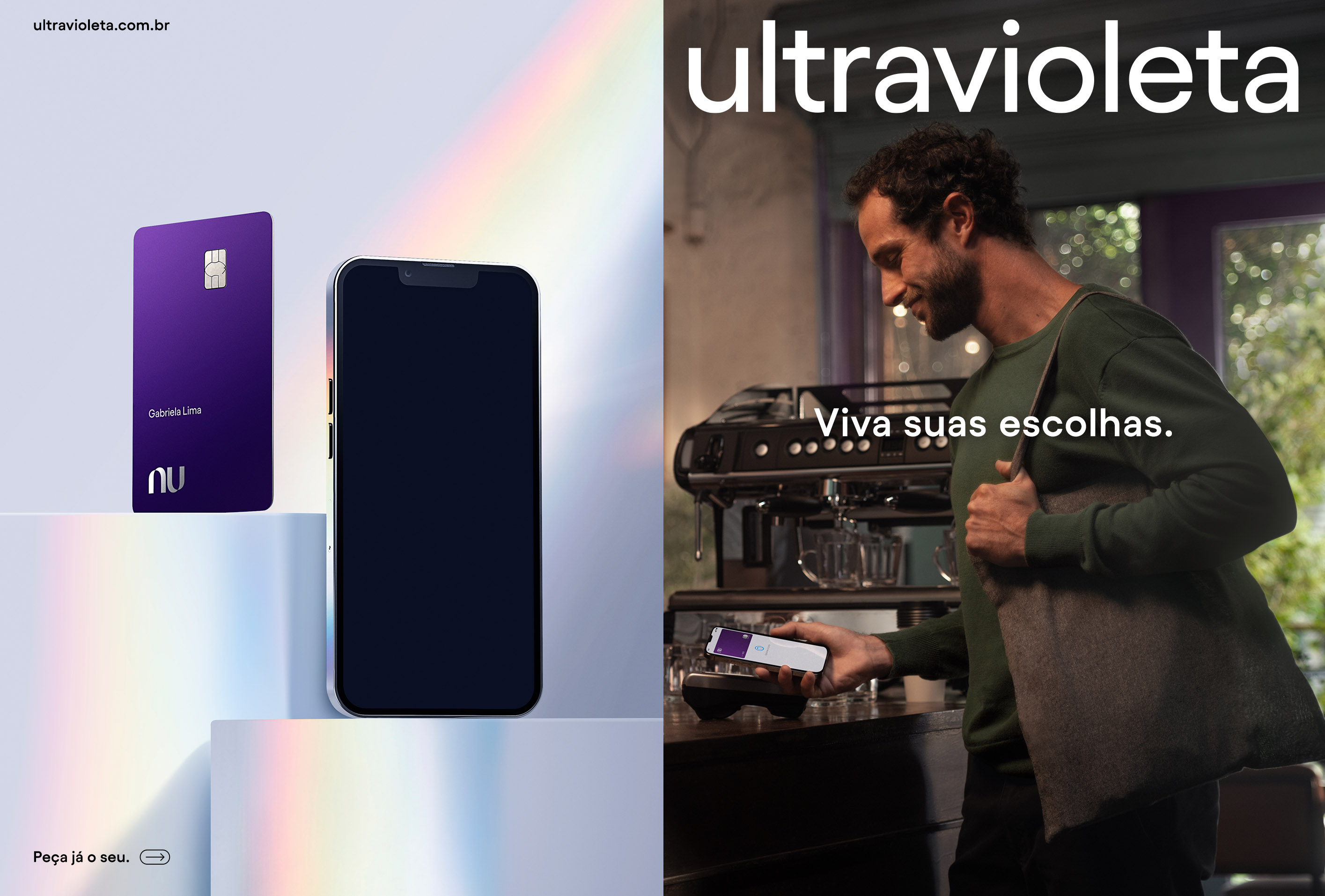
Ultravioleta – Key Visual
Ultravioleta is Nu's high-income's brand. The design approach follows the same high-quality standard for every Nu product but for this audience, it decided to explore different materials to increase the product's value.
My Role
Creative Direction
Design Direction
Nubank
2022
Creative Direction
Design Direction
Nubank
2022
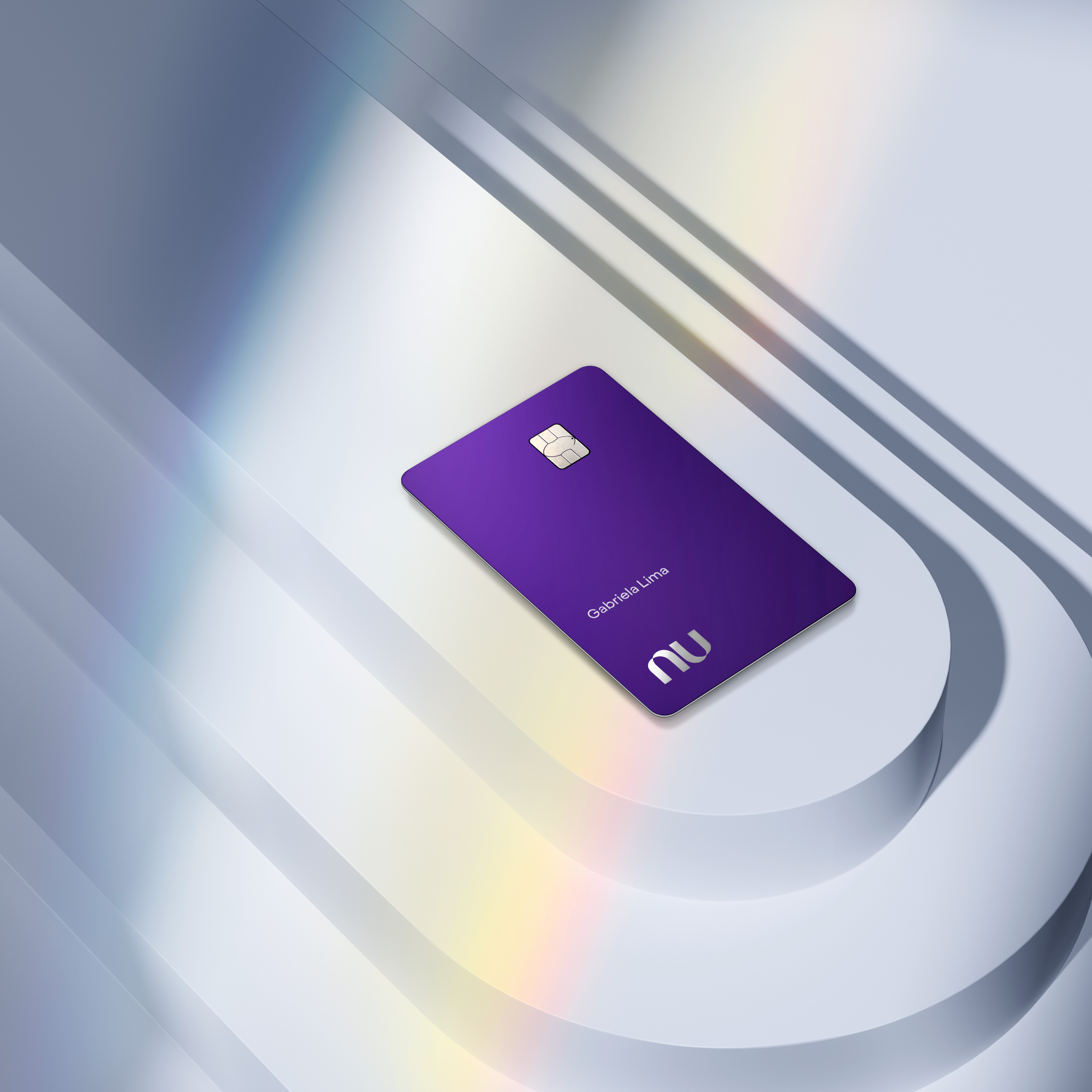
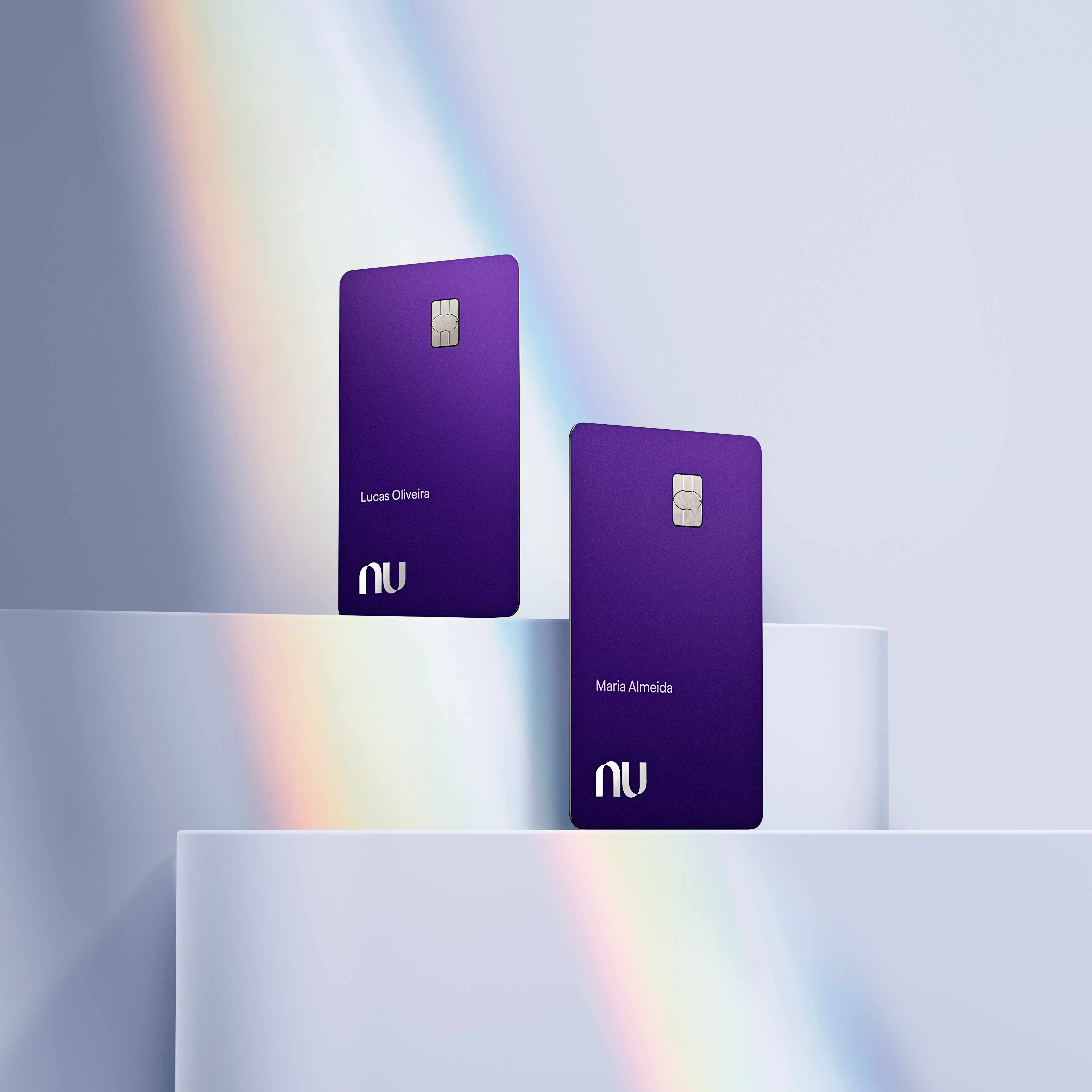
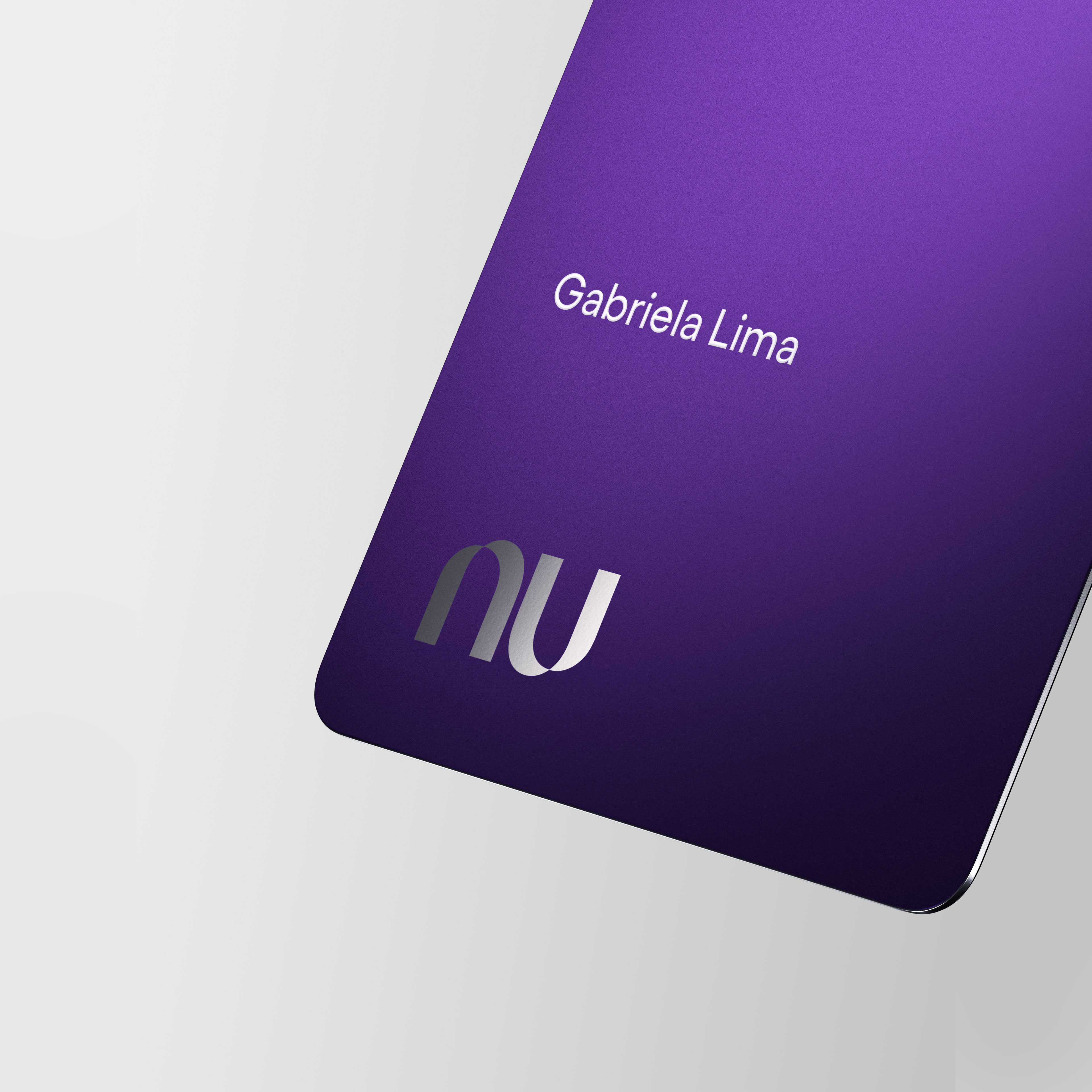
Card design
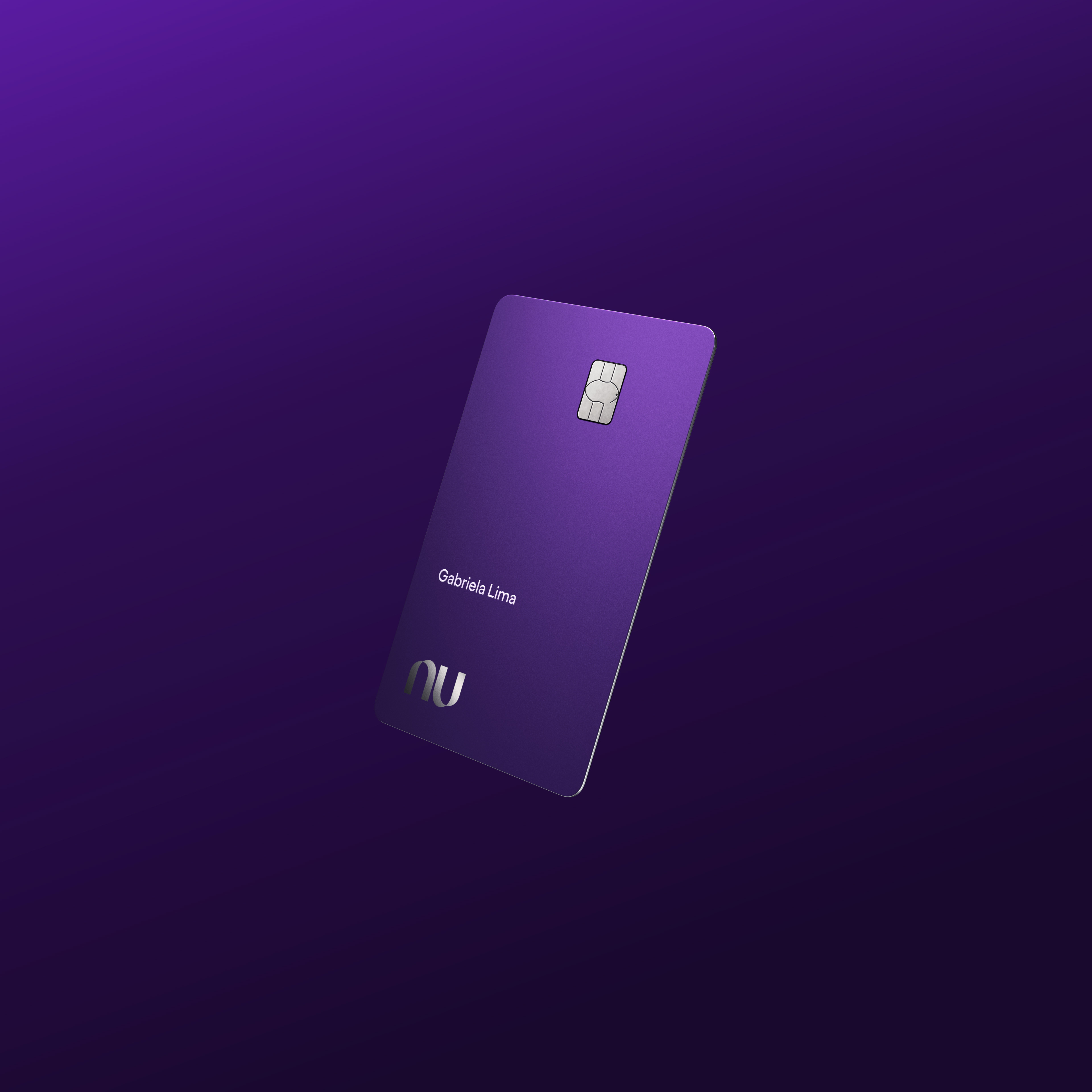
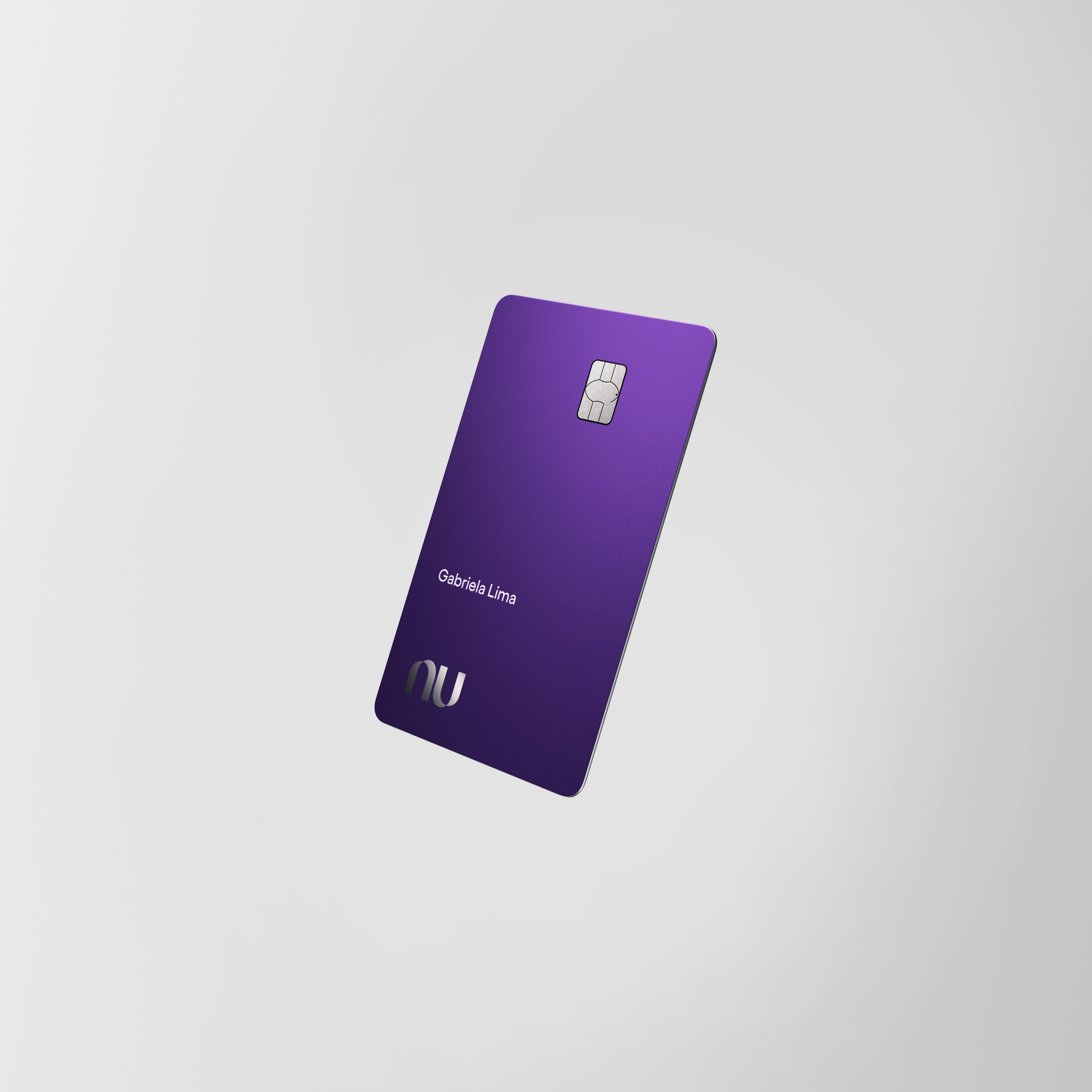
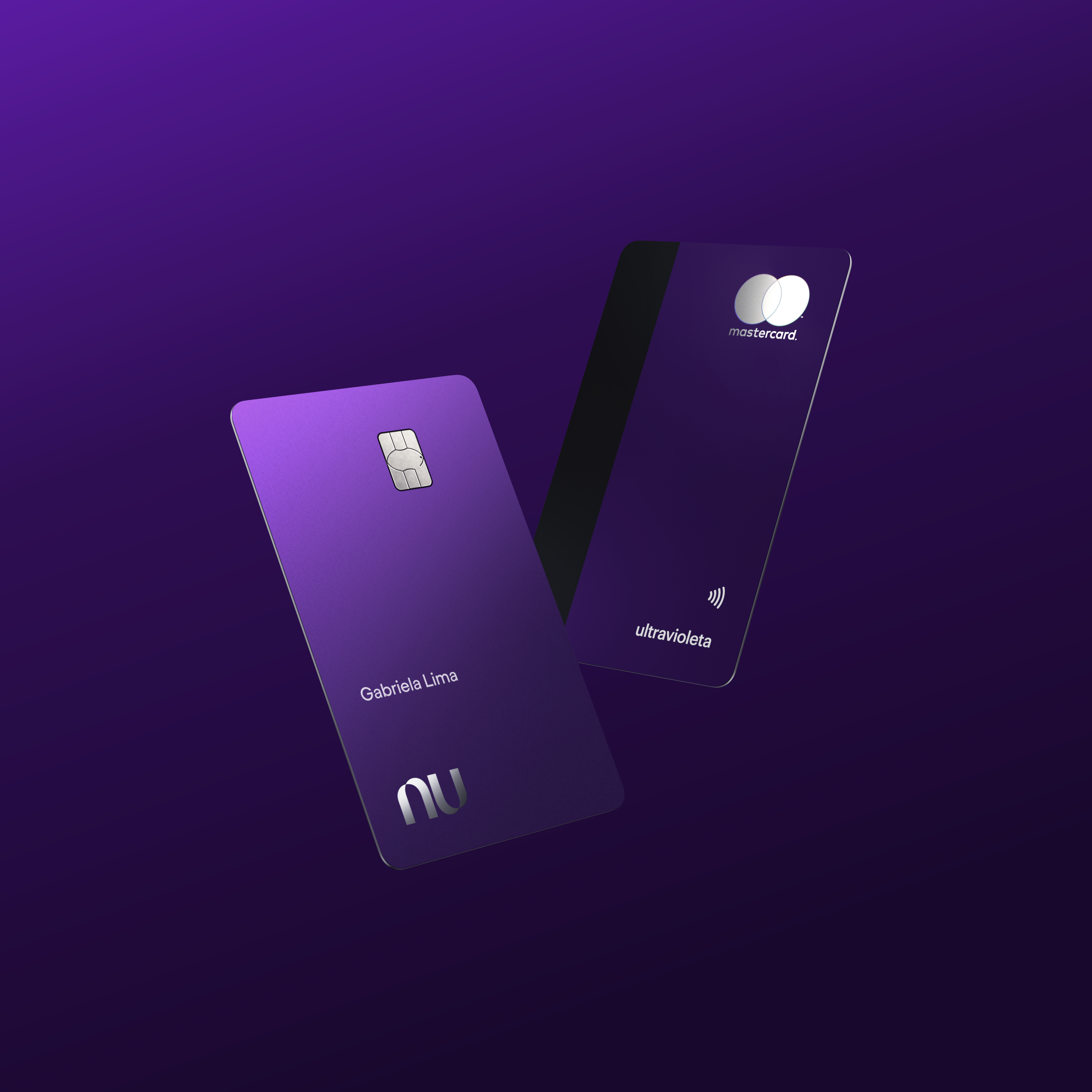
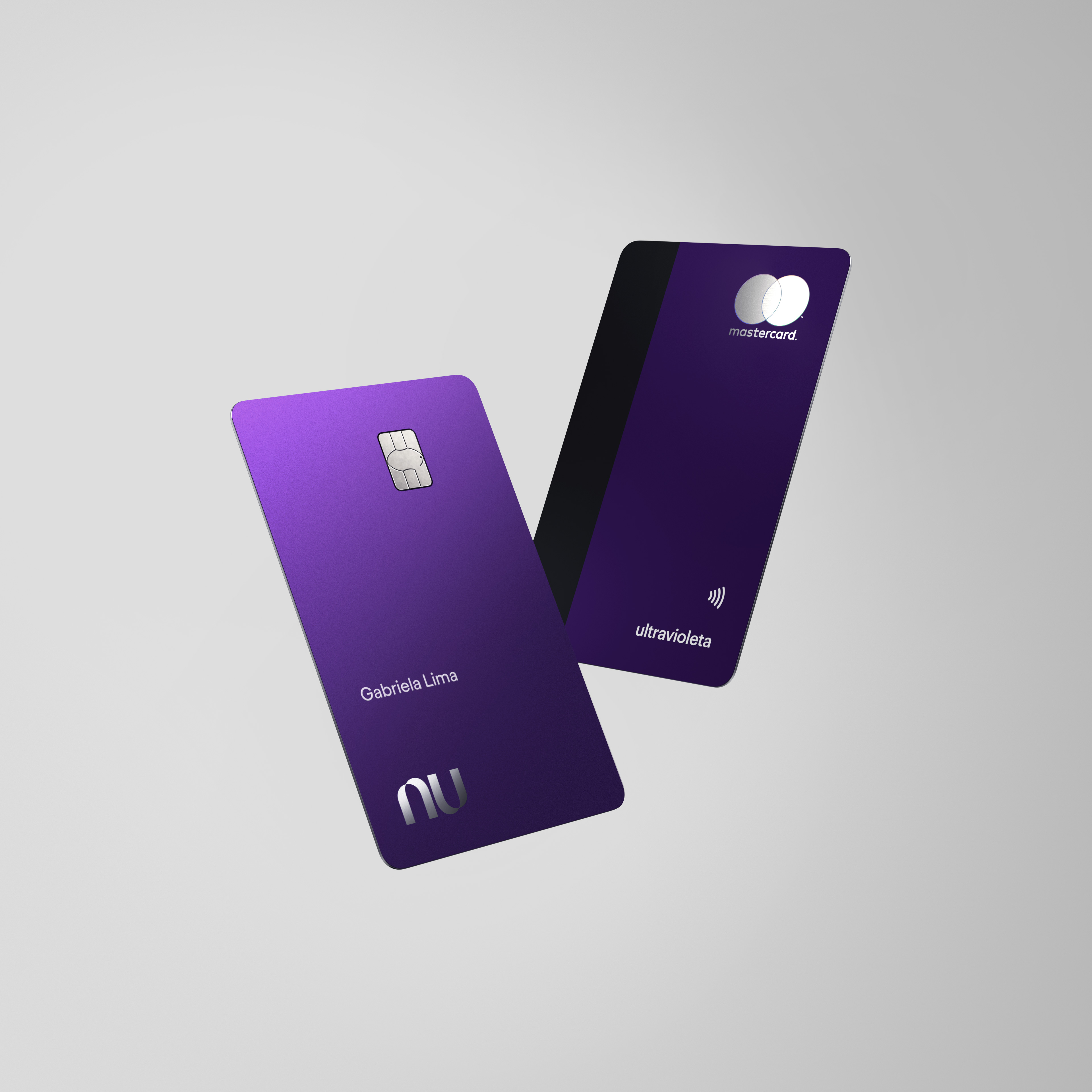
The card design is key in building desire. The Ultravioleta is a metal card, with high-quality finishing.
To increase security, the physical card is numberless, and all the additional information is placed in-app.
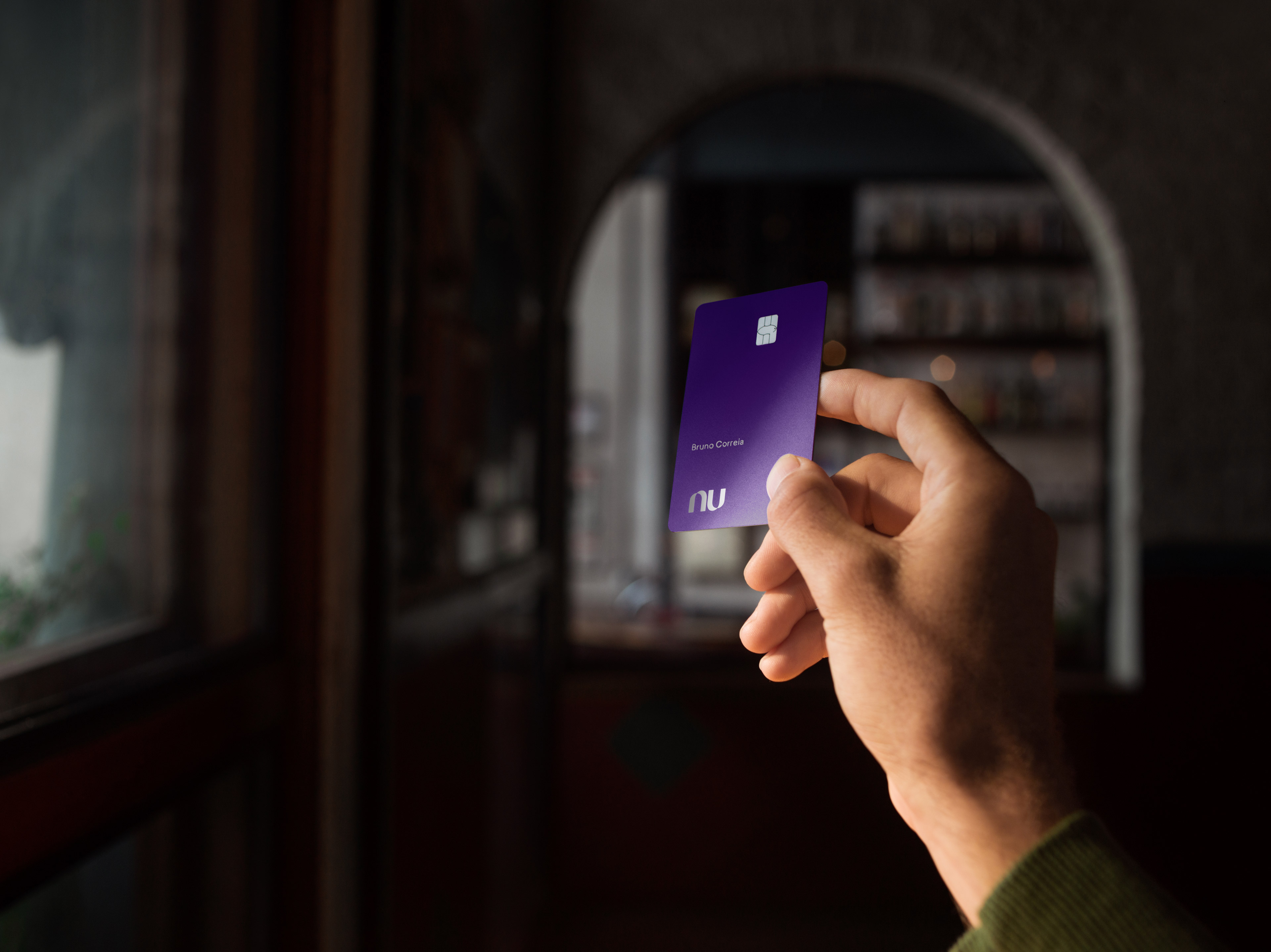
Product renders
Scenes
Scenes
The product renders scenes are composed by a pedestal to give more prominence to the product. The angles and composition also help to put the product on the top, highlighting its exclusive approach, and also its details like the metal borders, enhancing textures and highlighting Ultravioleta’s classy aspects.


Floating
The floating versions are used in-app and works both in light and dark mode. Giving to the design teams a more flexible images to works in terms of responsive aspects.


Details
Close-ups to show the main details of the product.

Photography
Product still
Product still
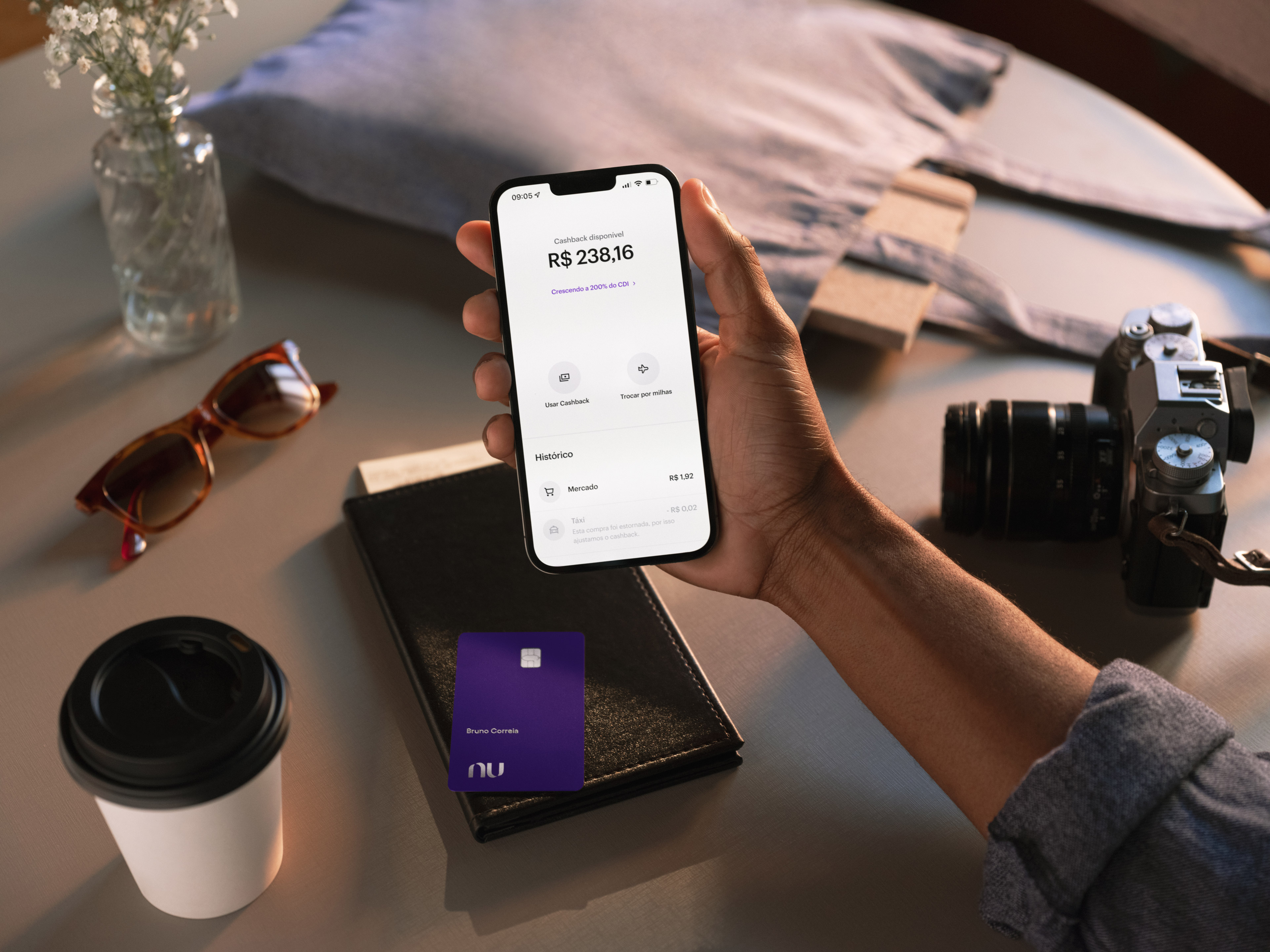


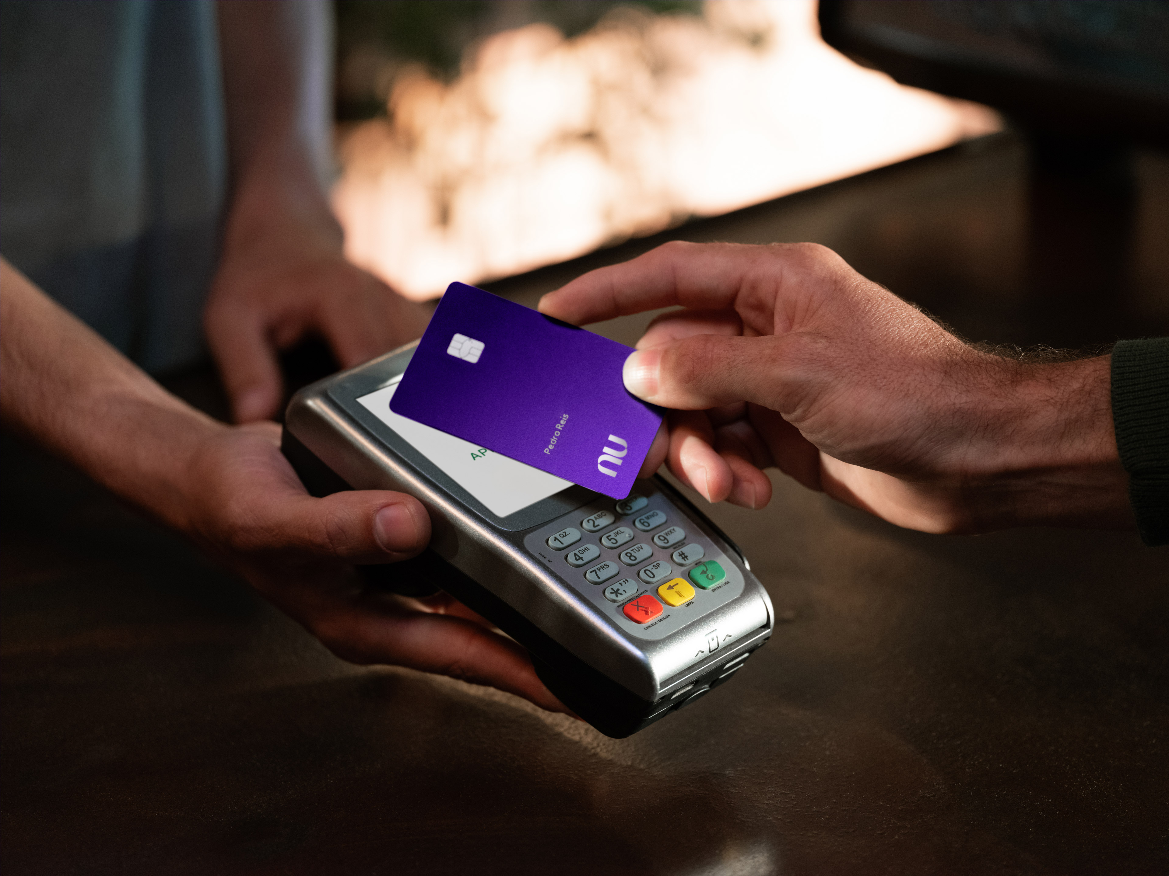
Lifestyle
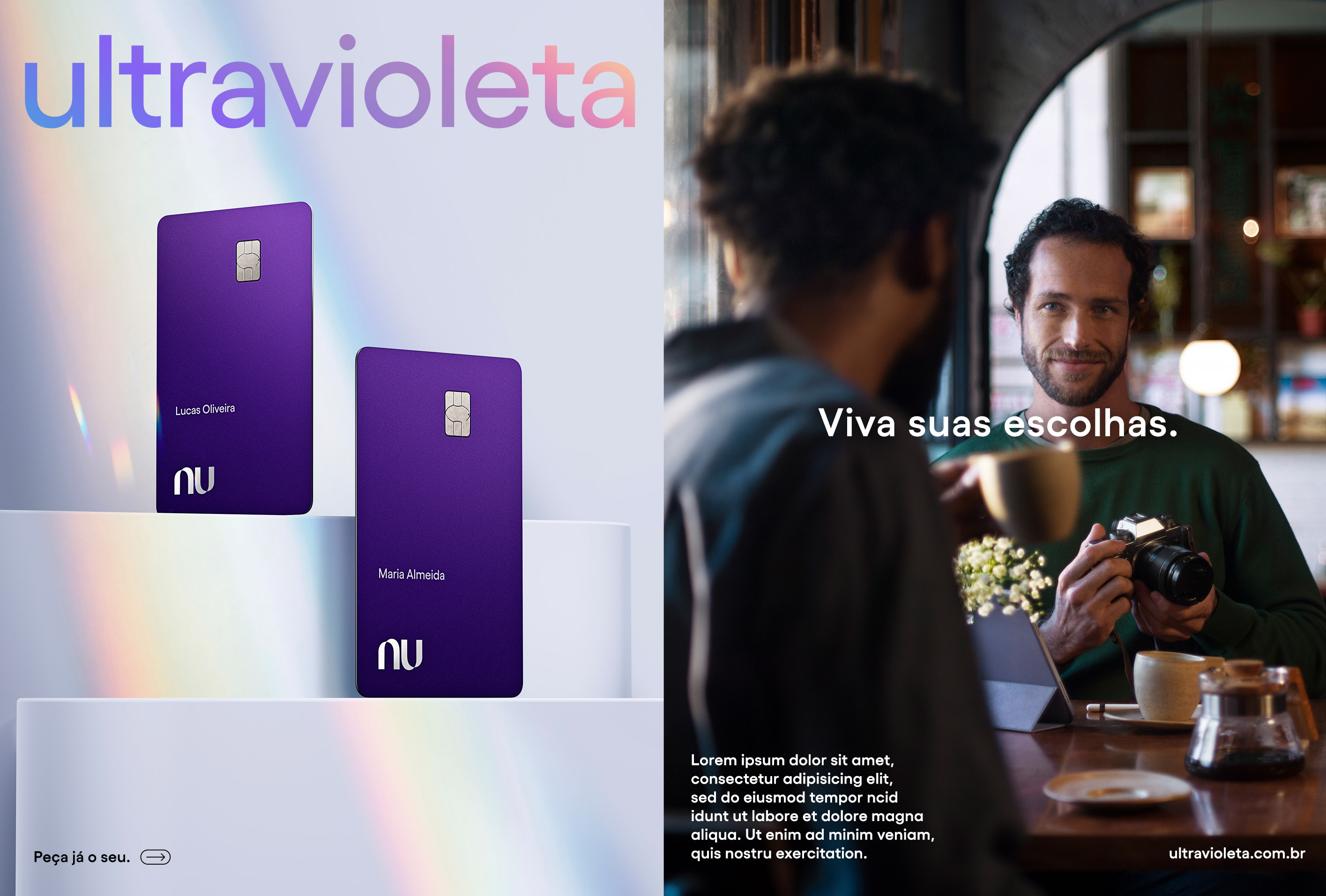
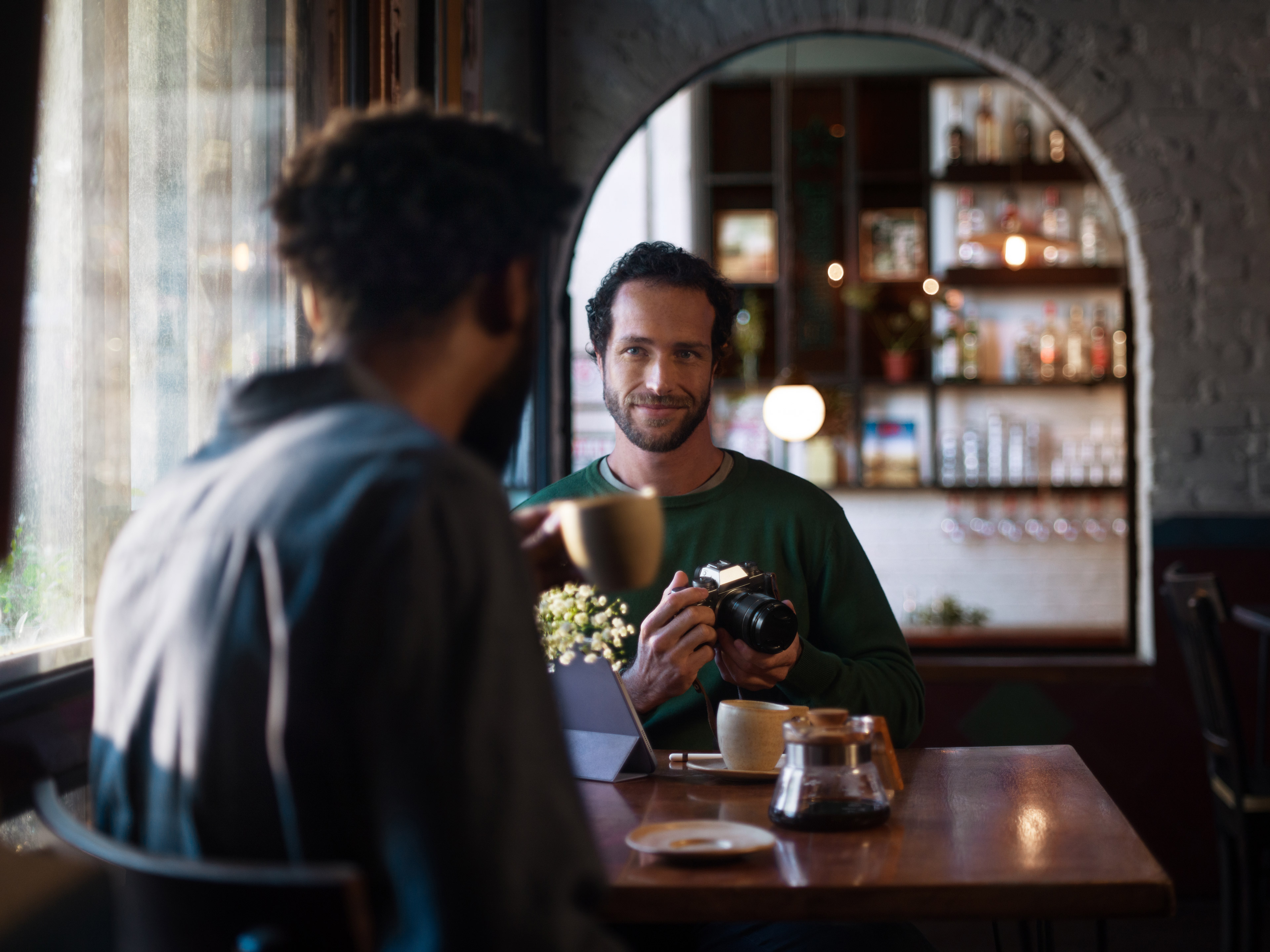
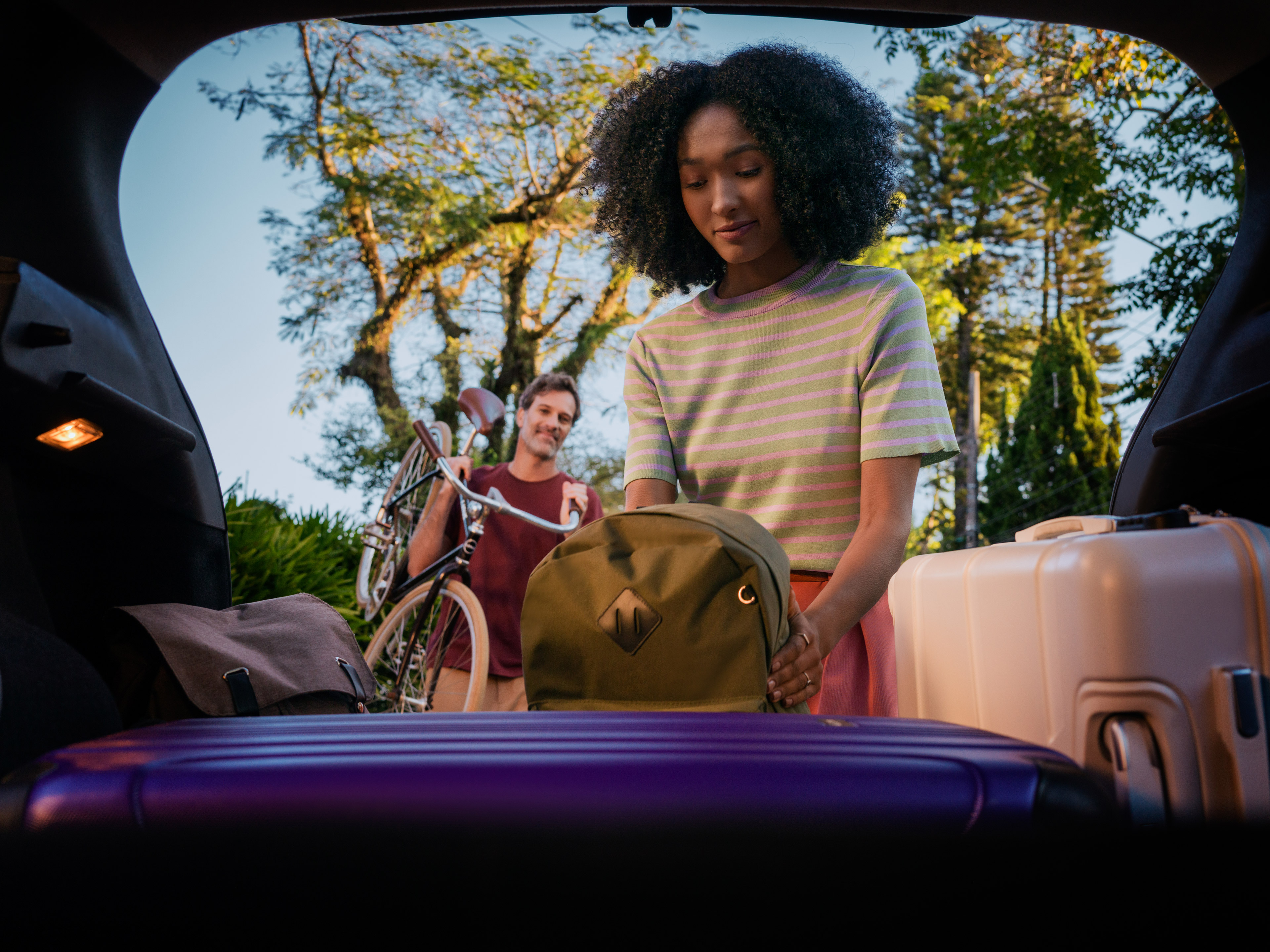
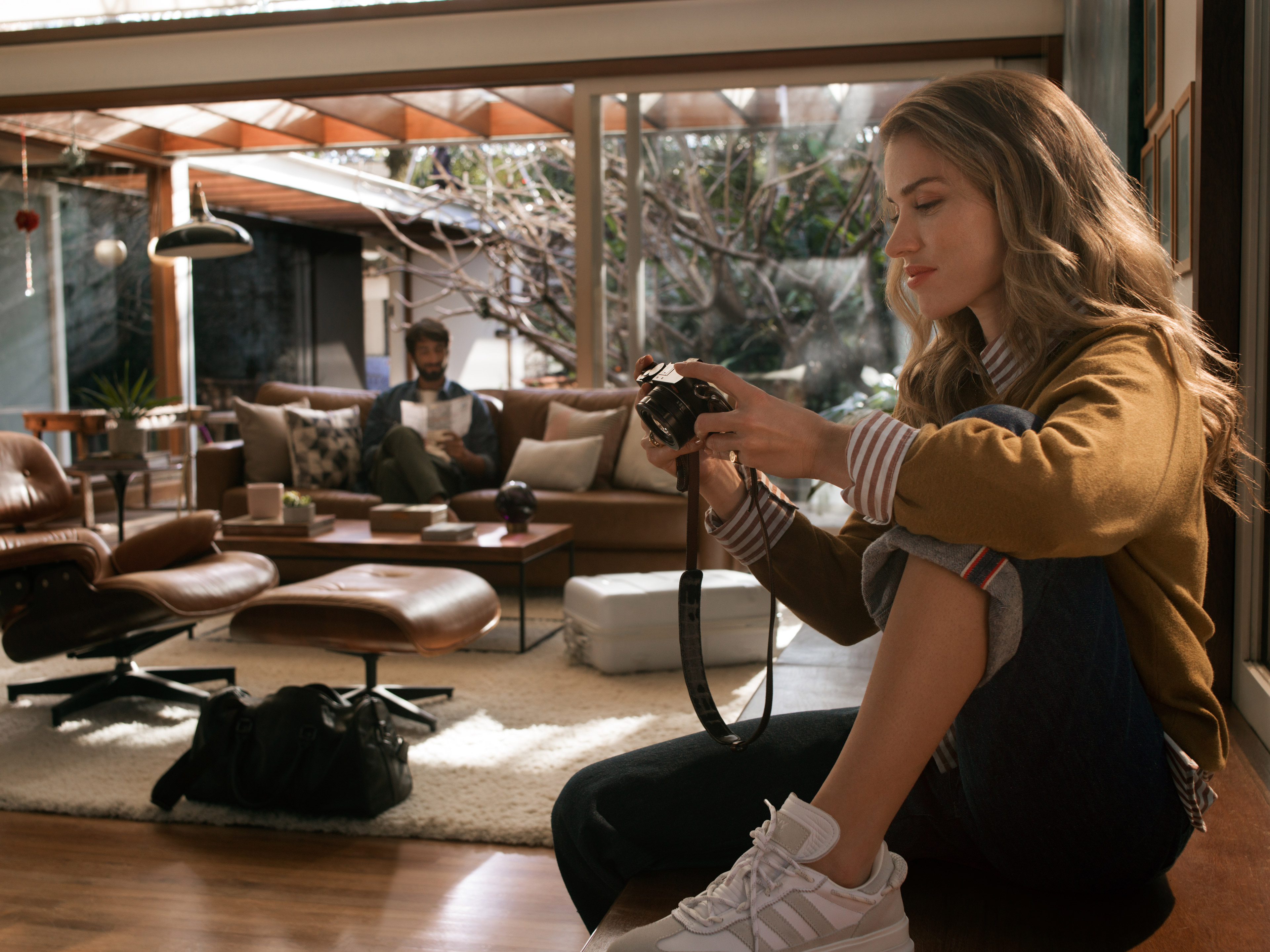
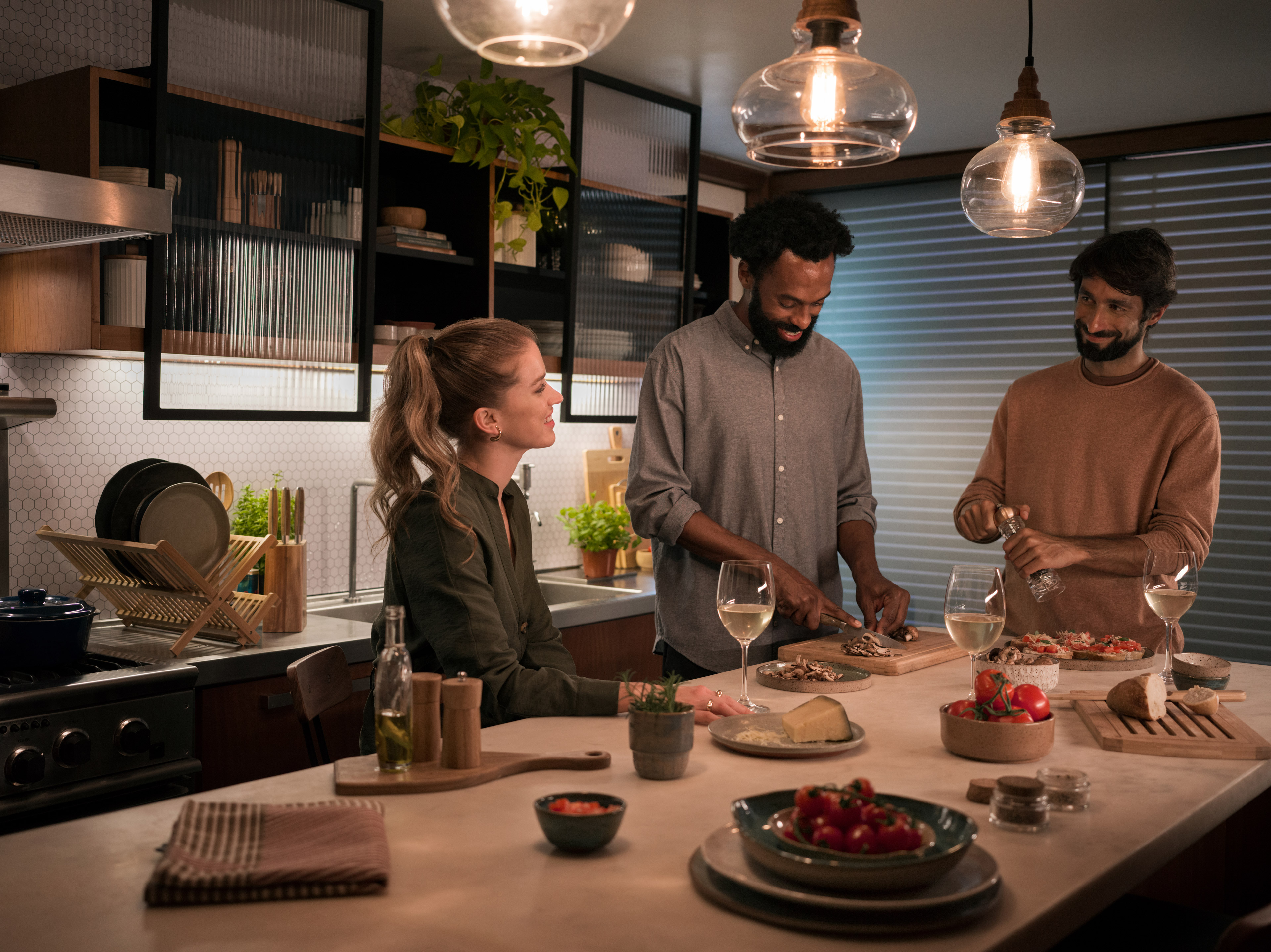
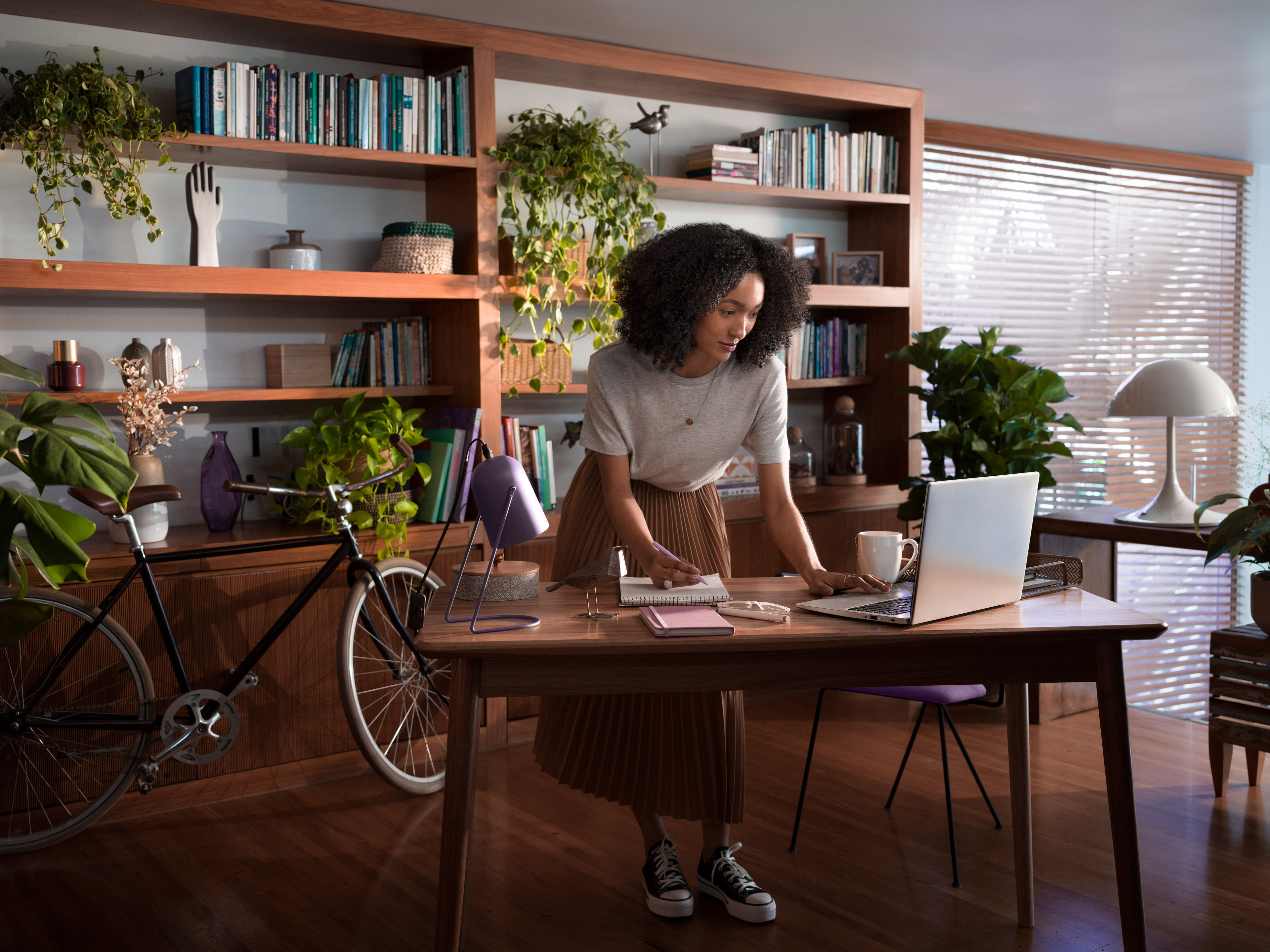
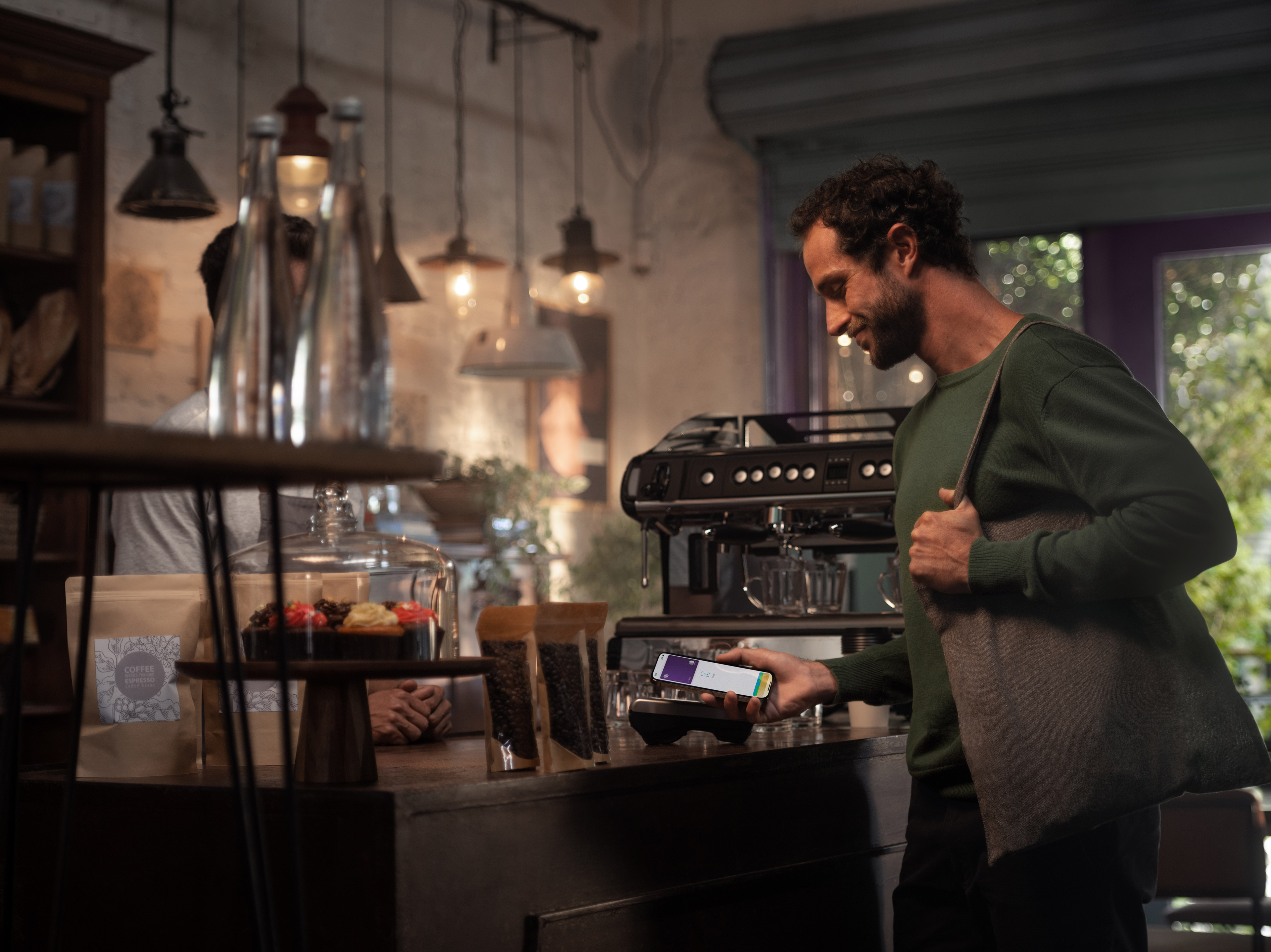
Nu's believe in the power of a good story to create significant connections, and the lifestyle images must fulfill this purpose, showing people being their best versions.
Nu's believe in the power of a good story to create significant connections, and the lifestyle images must fulfill this purpose, showing people being their best versions.


Key Visual
The Ultravioleta key visual is supported by the 3D renders and photos combined. They were thougth to be scalable to a wide range of medias and formats.