Nu – Brand System
In 2021 Nu launches its new logo. This represents a complete brand evolution and during a year the Brand Design team worked to update all the brand assets redesigning the Brand System, which includes basic elements like colors, typography, and the grid system but also the product like card designs, welcome kits, the app itself and any other point of contact.
The Brand System also helps Nu to maintain consistency and quality in its output across all platforms, countries, or services.
My Role
Creative Direction
Design Direction
Nubank
2022
Creative Direction
Design Direction
Nubank
2022
Cases
Each part of the system has its chapter inside the BrandBook Tool. Each asset has a case that explains its concept and makes the content scalable and friendly to watch.
Logo
Nu's brand is the visual expression of our strategy. The simplicity of the lines evokes the outstanding features of the solutions. Following the principle of avoiding anything that is excessive or unnecessary.
The curves, now softer, highlight our human aspect. And the letters’ details, which mimic something being twisted, represent change and evolution.
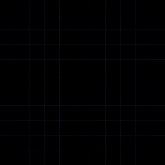
Grid System
The structure is based on a modular grid system with a simple visual approach designed to better accommodate different types of content and applications.
The structure is based on a modular grid system with a simple visual approach designed to better accommodate different types of content and applications.
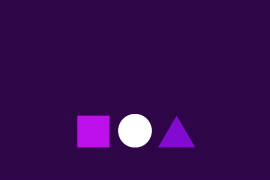
Icons
The brand’s iconography is a key element in digital interfaces. Design and shapes must be simple and intuitive.
The brand’s iconography is a key element in digital interfaces. Design and shapes must be simple and intuitive.
Motion Guidelines
How the visual elements behave on the screen can bring the work to life. Animation has the power to improve the way things are communicated and the motion guidelines help Nu's identity to make recognizable also in movement.
How the visual elements behave on the screen can bring the work to life. Animation has the power to improve the way things are communicated and the motion guidelines help Nu's identity to make recognizable also in movement.
Photography Guidelines
Everything has a role in communication, and our use of photography is no exception. The care and craft in the imagery choices demonstrate the commitment to relatable communication and Nu's values.
Everything has a role in communication, and our use of photography is no exception. The care and craft in the imagery choices demonstrate the commitment to relatable communication and Nu's values.
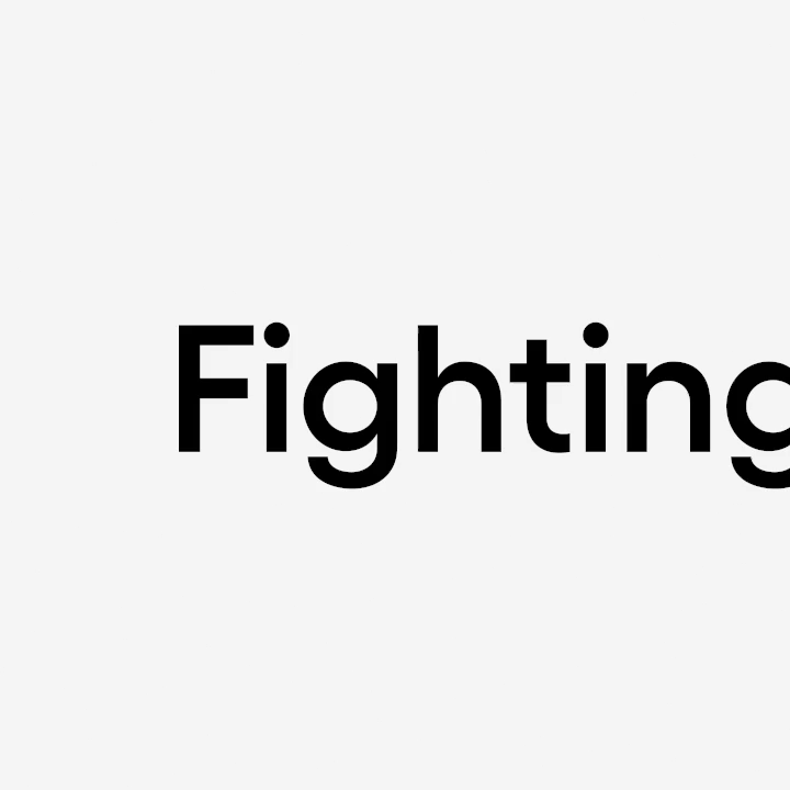
Typography
Nu's corporate typeface is Gellix. And it is used in all brand communications. It's simple, clean, and easy to read. It also features a wide range of weights, which allows the designs to be more flexible and dynamic.
Nu's corporate typeface is Gellix. And it is used in all brand communications. It's simple, clean, and easy to read. It also features a wide range of weights, which allows the designs to be more flexible and dynamic.
Colors
Purple is Nubank. It is the corporate color used in all communication, products, and internal and external pieces.
The primary colors may be associated with other secondary tones to complement and creates a more diverse range of applications.
Purple is Nubank. It is the corporate color used in all communication, products, and internal and external pieces.
The primary colors may be associated with other secondary tones to complement and creates a more diverse range of applications.
Ultraviolet
For Ultraviolet, we use dark purple tones to offer the same principles of the upmarket segment. Although the UV has its unique look and feel following the Nu product family standards but has its special tweaks that make the communication premium.
For Ultraviolet, we use dark purple tones to offer the same principles of the upmarket segment. Although the UV has its unique look and feel following the Nu product family standards but has its special tweaks that make the communication premium.
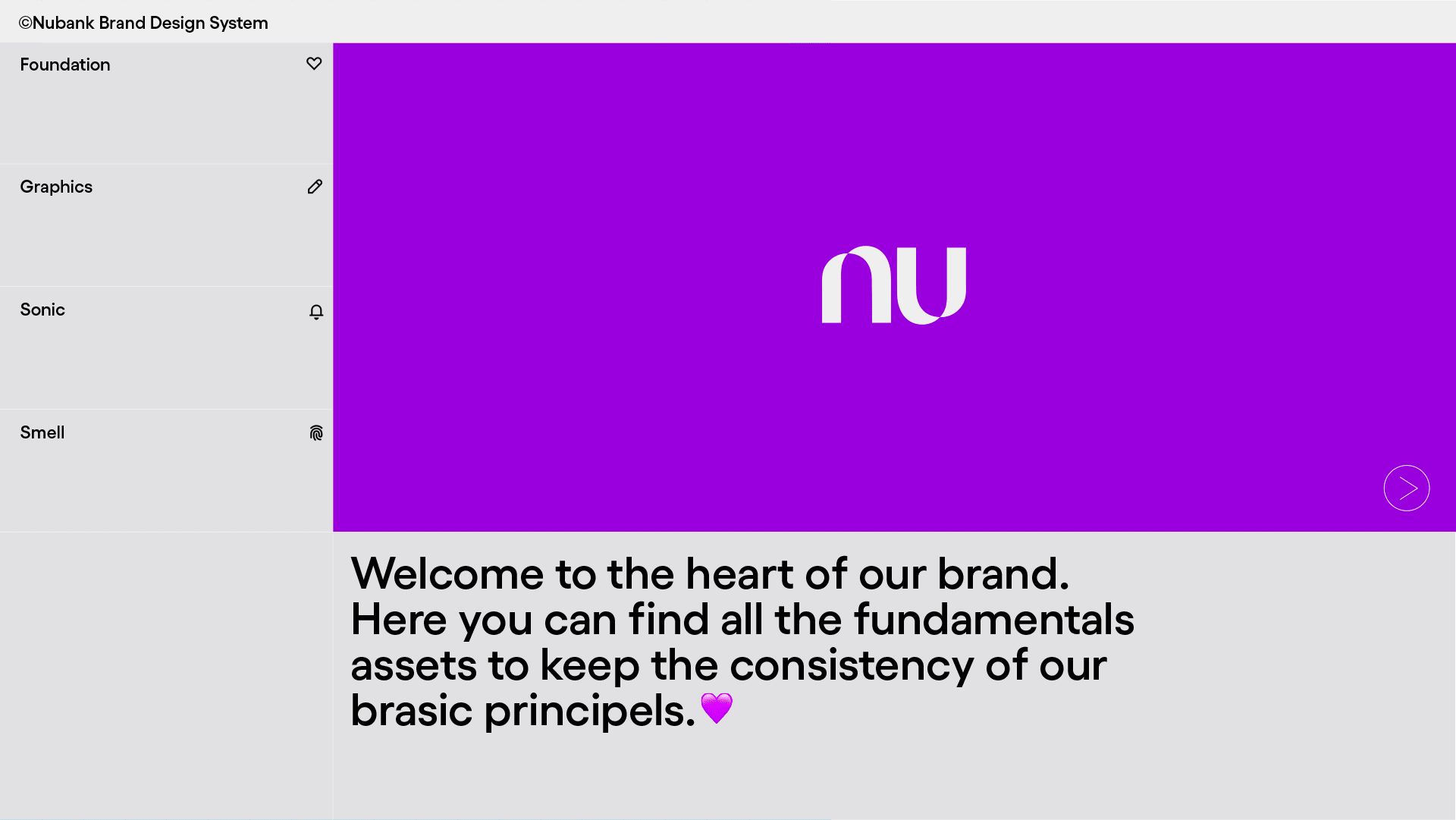
BrandBook Tool
We translated our Nu Brand System into a new and interactive BrandBook Tool—a public and online platform that can be accessed here—to stimulate curiosity and grow the adherence to the use of brand guidelines. The Tool's modular structure gives the platform more fluidity to update and insert new content. It also helps to deliver a great experience by showcasing our design foundations through interactive content and tools, where all the brand assets can be stored, delivered, and downloaded.
Go to brand.nu.com.br and enjoy.
Taking decisions
To find the right shape of the platform – from the home to how to dispose of the content and the search engine – aiming for the most accessible and friendly way of navigation, there was a long and exciting journey of explorations and design critiques until the final design structure.
"Taking decisions is a process. The important thing is to drive the process to constant evolution. It's also important to listen to the customer's feelings and build new ones from the things we learn from the interactions."
Image BrandBook Tool – Home evolution.
Content & Tools
The content of each section is disposed of in tabs. They were created for online and offline consultation, on the website, and also in a PDF version. In the online version, all sections also have an explanatory video about the importance and correct use of the brand asset disposed on the screen.
There are several interactive sections with tools to help the collaborators in their design routines. Here are some examples:
Color picker When navigating on Nu's primary and secondary colors, by hovering the mouse over the colors the user discovers more information about each one and, with just one click, can automatically copy the HEX code.

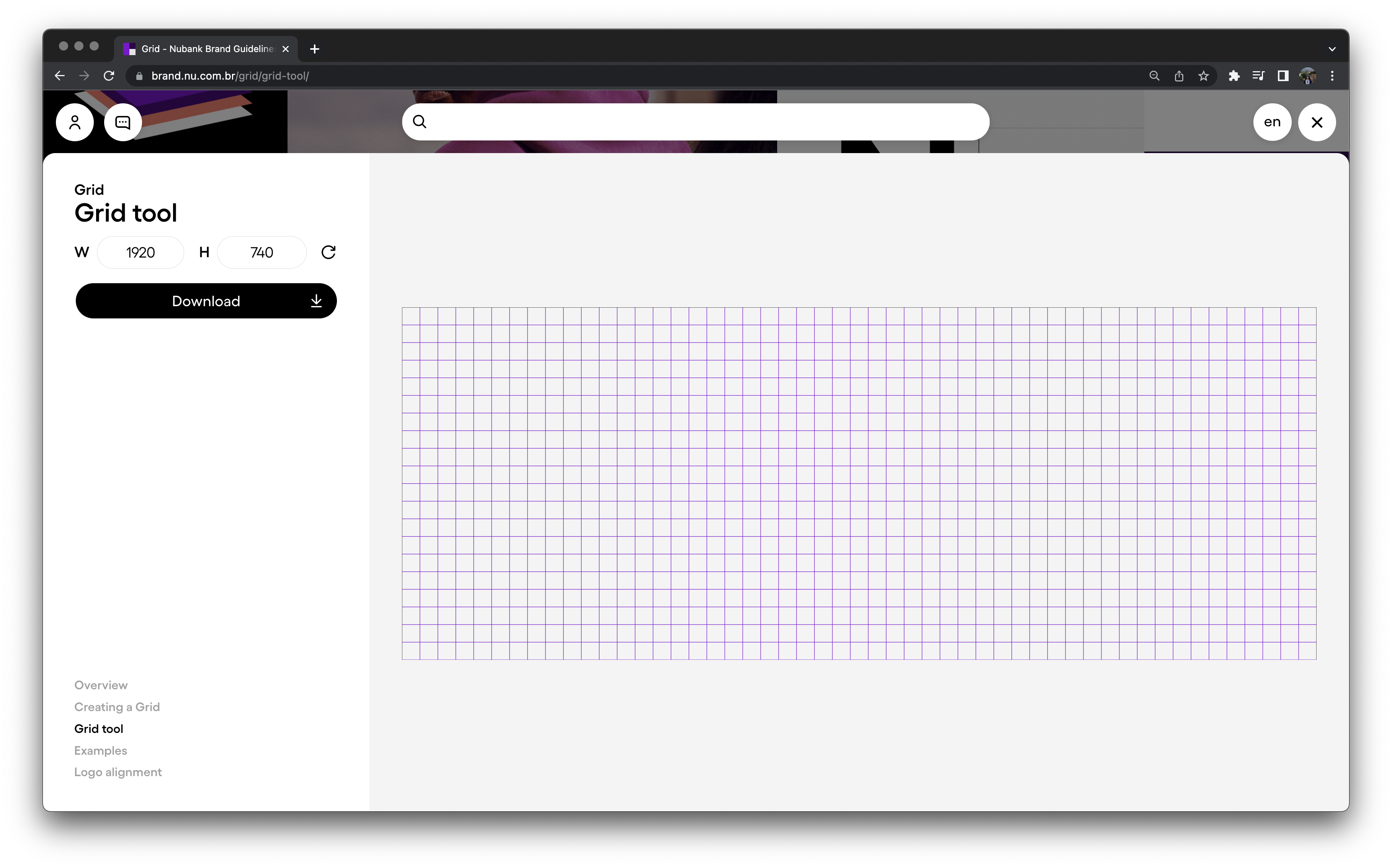
Grid generator: The “Grid Tool” helps the user to produce and download grids according to the specifications needed. The user can change the height and weight values and click on the arrow to update the shape, and then download it.
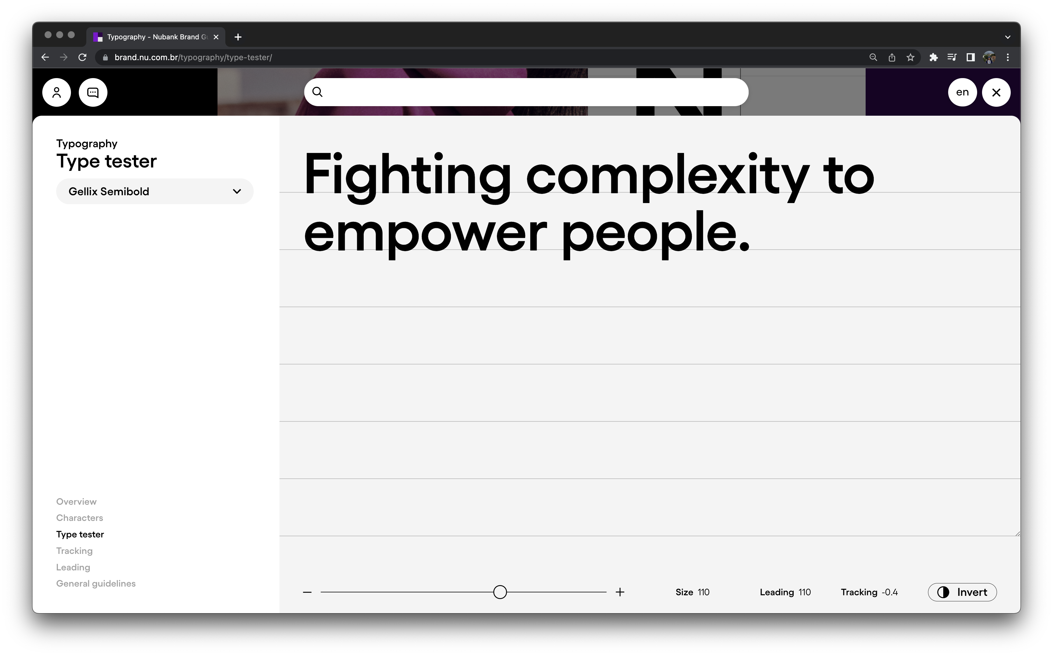
Typeface settings: The “Type Tester” allows the user to browse and test Nu's Gellix font in different settings. You can choose the type of font you want, change the font size to view the correct spacing between lines and characters, and test it in dark mode, for instance.
Thumbnails
The thumbnails were animated aiming to catch the user's attention. For that reason, we made animation loops, with specific design icons which help to better explain the content's nature.
The thumbnails were animated aiming to catch the user's attention. For that reason, we made animation loops, with specific design icons which help to better explain the content's nature.