La Cura – Visual Identity
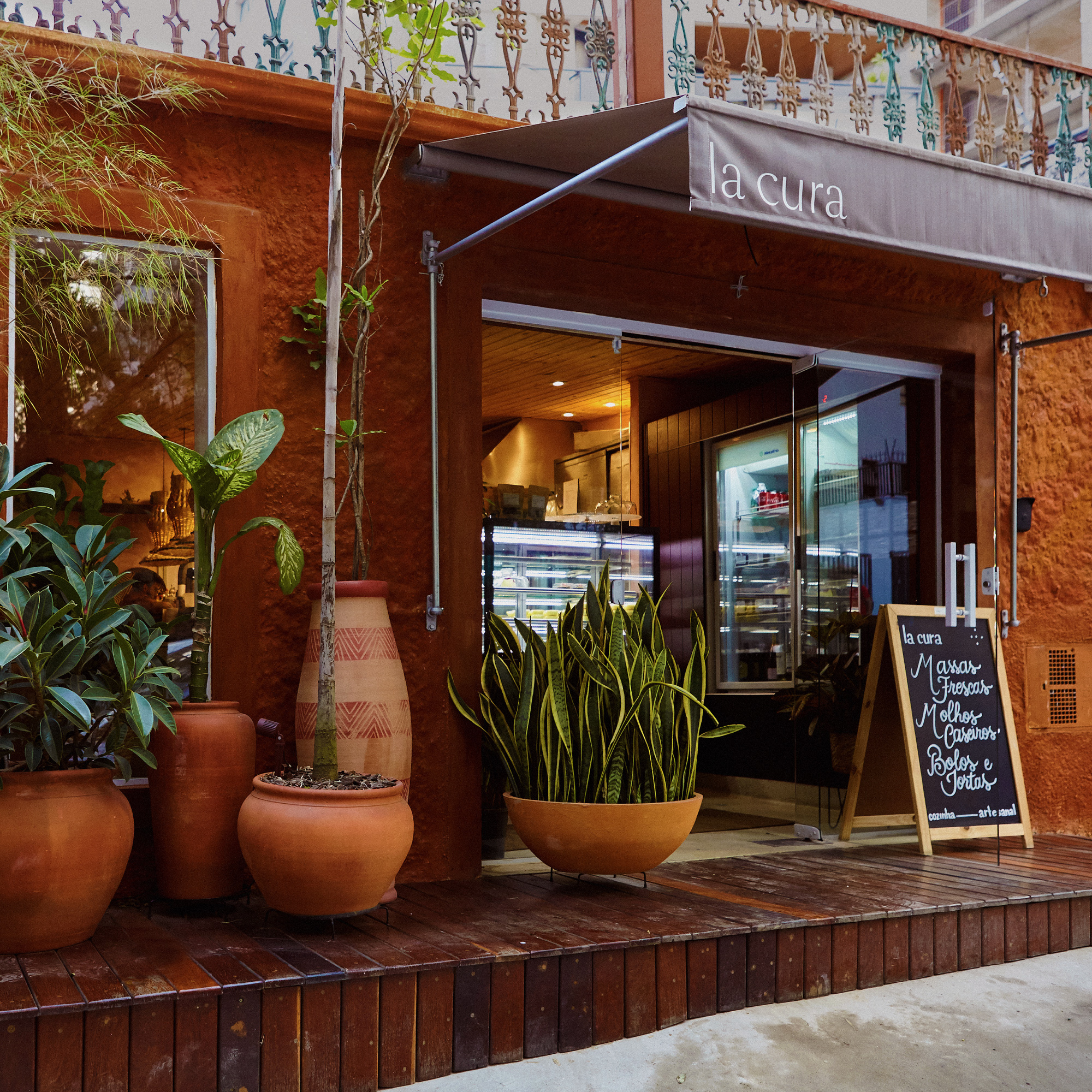
La Cura is a rotisserie founded by the chef Ivan Santinho located in São Paulo, Brasil. In partnership with Santinho, we designed the brand from the ground. Thinking about the plates, naming, packaging, architecture, and the service itself.
My Role
Co-founder
Creative Direction
Design Direction
Lead Design
La Cura
2019 – Currently
Co-founder
Creative Direction
Design Direction
Lead Design
La Cura
2019 – Currently

Concept
Logotype
We have found in The SangBleu from the Swiss typefaces foundry the balance between the simple, delicate, and human. In general, it's used with the cross Icon.
The name La Cura (The Cure in eng.) comes from the idea of "restore" which is the origin of "restaurant". The idea of food as the most sensible thing which the great food has the power to restore, to cure.
LogotypeWe have found in The SangBleu from the Swiss typefaces foundry the balance between the simple, delicate, and human. In general, it's used with the cross Icon.

Packaging
The idea of being as sustainable as possible it's part of our values. This is reflected in all the initiatives, including the packaging that is part recyclable and another part biodegradable.
The idea of being as sustainable as possible it's part of our values. This is reflected in all the initiatives, including the packaging that is part recyclable and another part biodegradable.
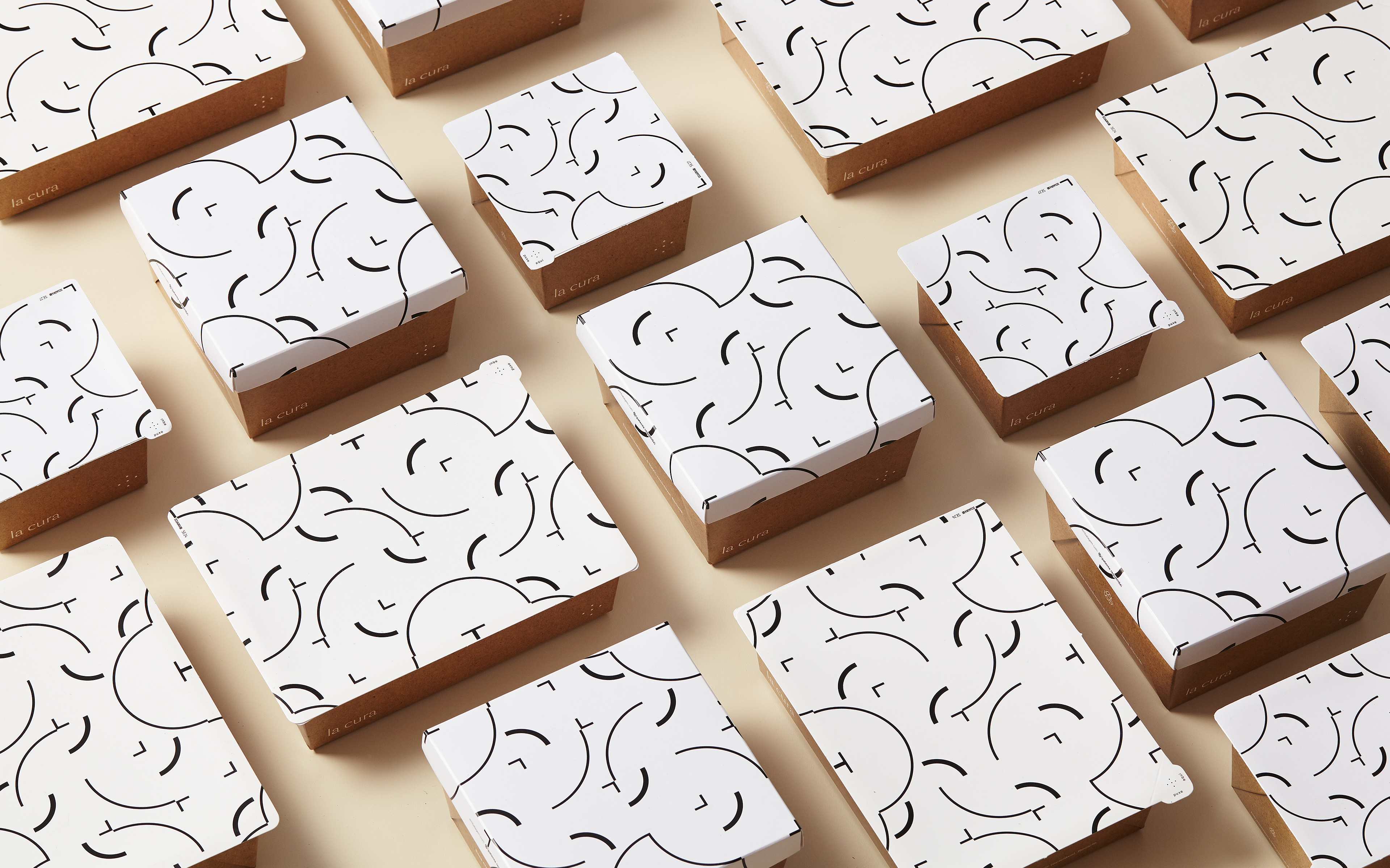

The Pattern
The pattern was made by deconstructing the cross Icon, original composed by 5 dots.
The pattern was made by deconstructing the cross Icon, original composed by 5 dots.


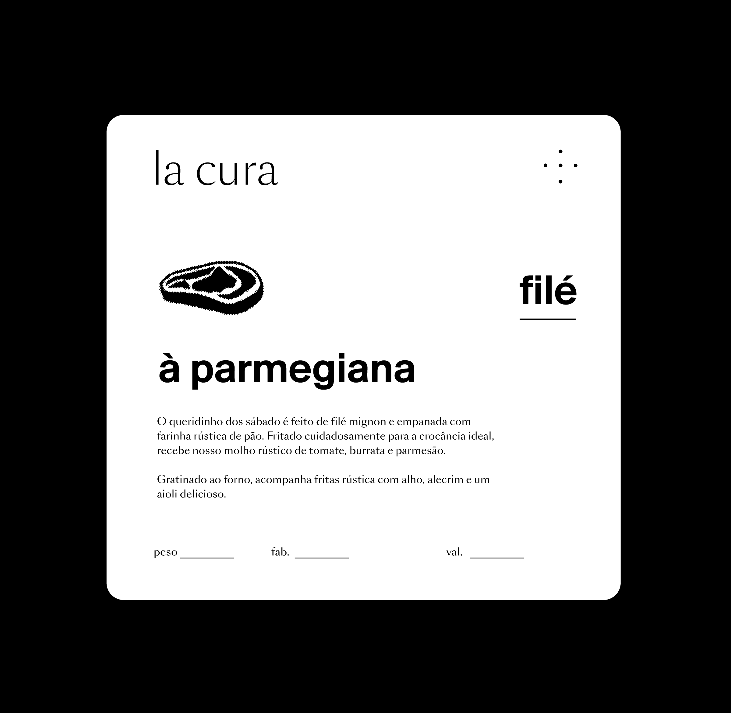
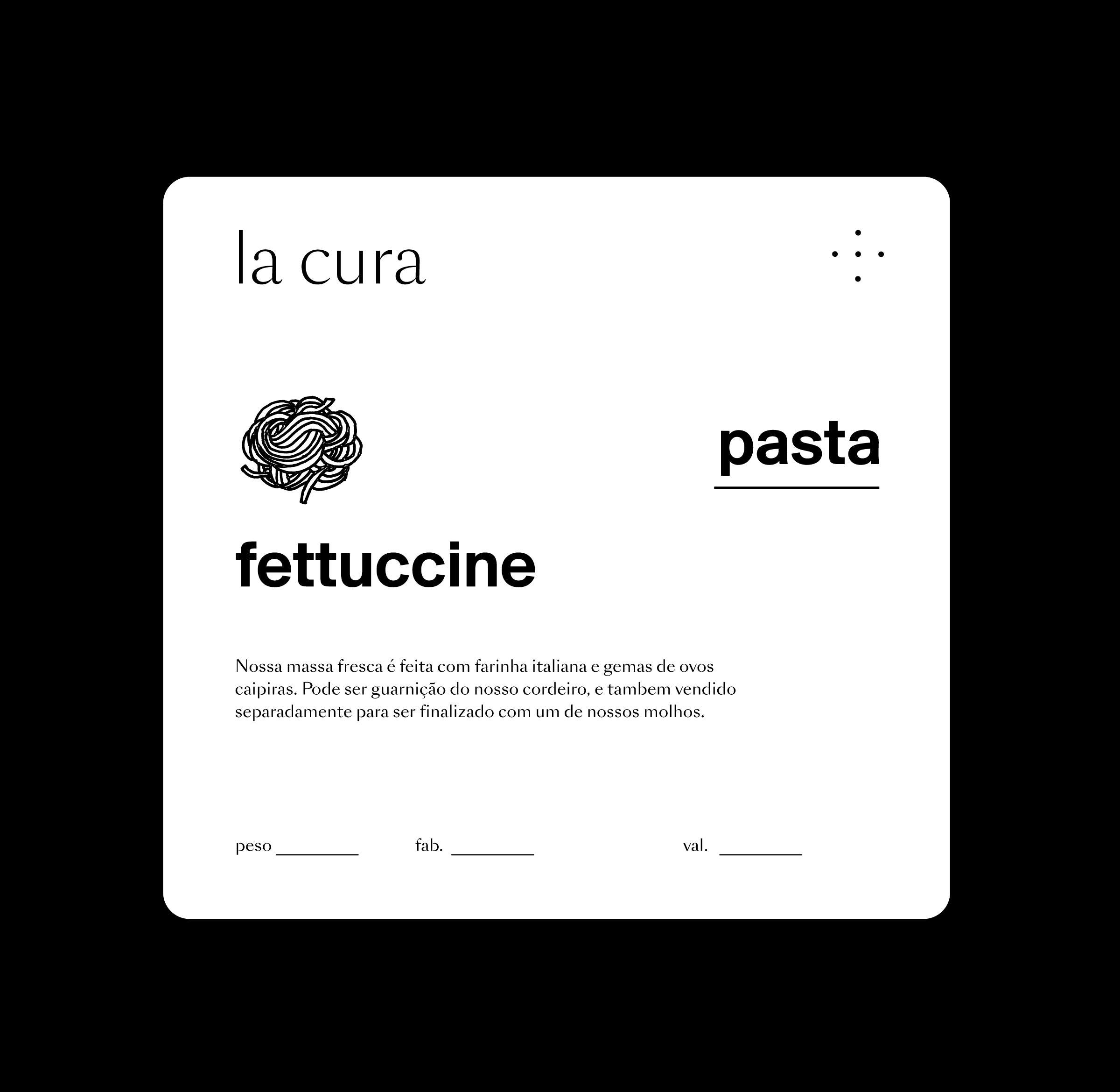
Labels
They are the fundamental basis of our identity. Since the beginning, we look to be capable to produce our own packaging. The label was a smart solution in terms of how we stock the packaging material, giving us the flexibility to buy small quantities of packages and produce on demand in-house and crafted for each customer.
Strucutre
Based on a simple structure, the labels have a differente illustration for each plate. For the plates main titles we use the secondary typeface Suisse also from the Swiss Typefaces Foundry.
Combined they create the right balance between bold and delicate.
The additional information is also uses La Cura's primary typeface – Sang Bleu.


Photography
We started the operations during the pandemic, and the issue was how to sell great food without any physical interaction.
We started the operations during the pandemic, and the issue was how to sell great food without any physical interaction.
The pictures were designed to create desire and also catch the customer's attention. In this way, we created an almost–graphic approach to reinforce the strong personality of the food.
We created 3 kinds of assets.
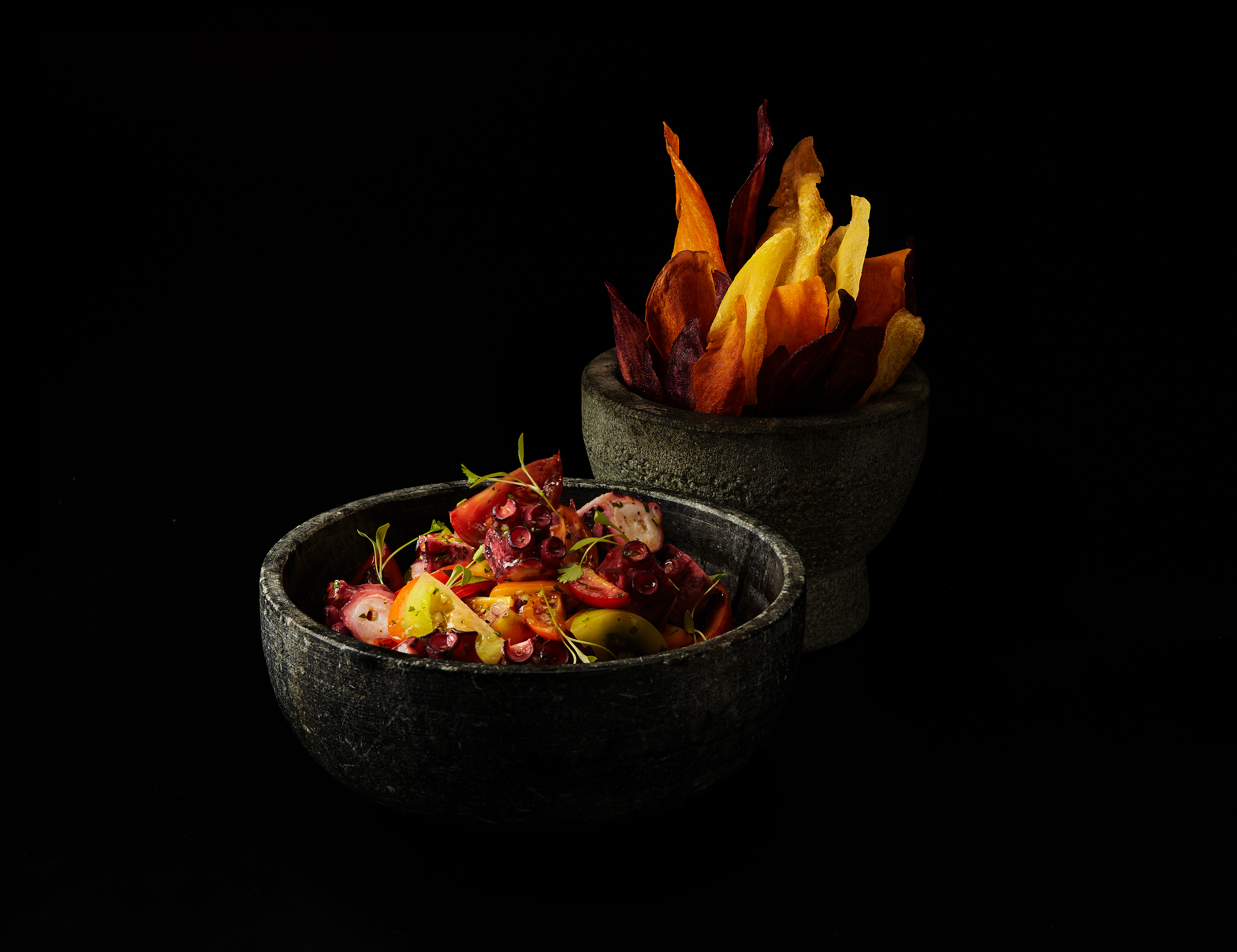
Studio
Studio photography was used to create a distinctive language.
For this path, we used two background colors. Off-white and Black.
Studio photography was used to create a distinctive language.
For this path, we used two background colors. Off-white and Black.


The first were used to the packaged line and the black to present the food in plates, inspired by a baroque style.

Process
This kind of assets are extremely important to show all the passion and craft behind the food.
This kind of assets are extremely important to show all the passion and craft behind the food.


Ambient
This first kind of asset was used to create relatability with the customers, by putting the food in a cozy place.
This first kind of asset was used to create relatability with the customers, by putting the food in a cozy place.


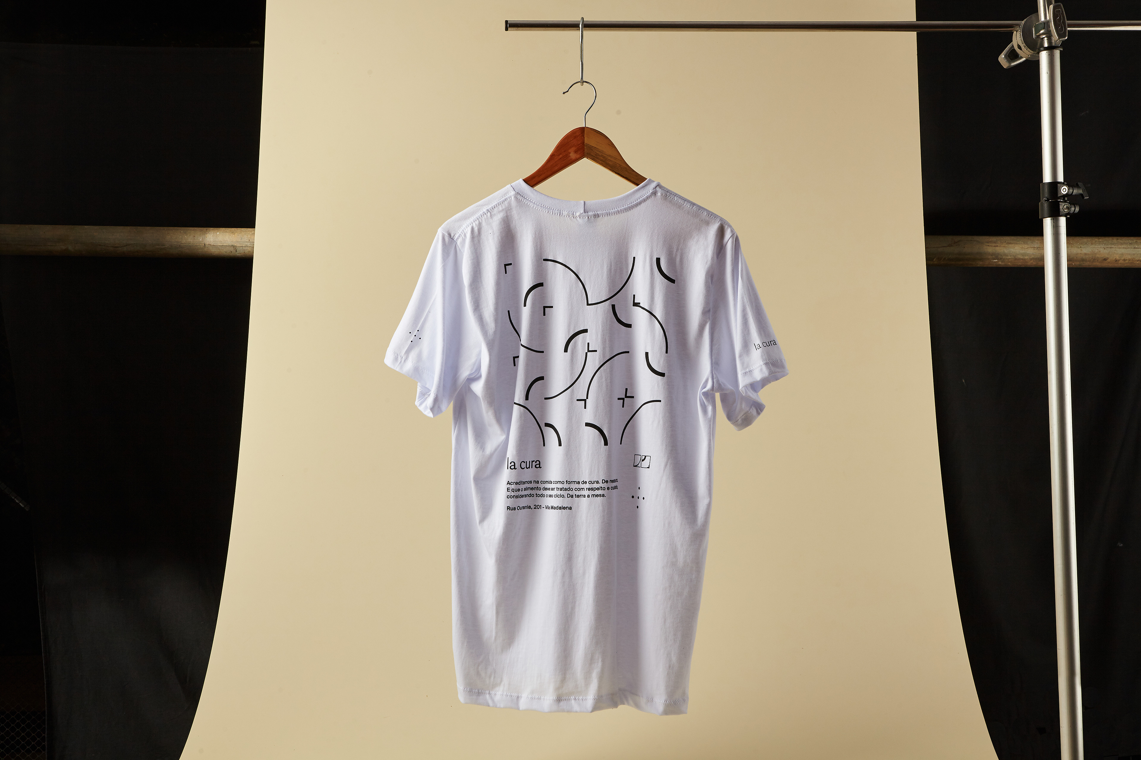
Brand derivations
Cards, t-shirts and even custom hydraulic tiles compose the assets that goes beyond the brand core product's communication.
Cards, t-shirts and even custom hydraulic tiles compose the assets that goes beyond the brand core product's communication.