King Cap
Visual Identity
.
My Role
Creative Direction
Lead Design
Typography
King Cap
Moio
2013
Creative Direction
Lead Design
Typography
King Cap
Moio
2013
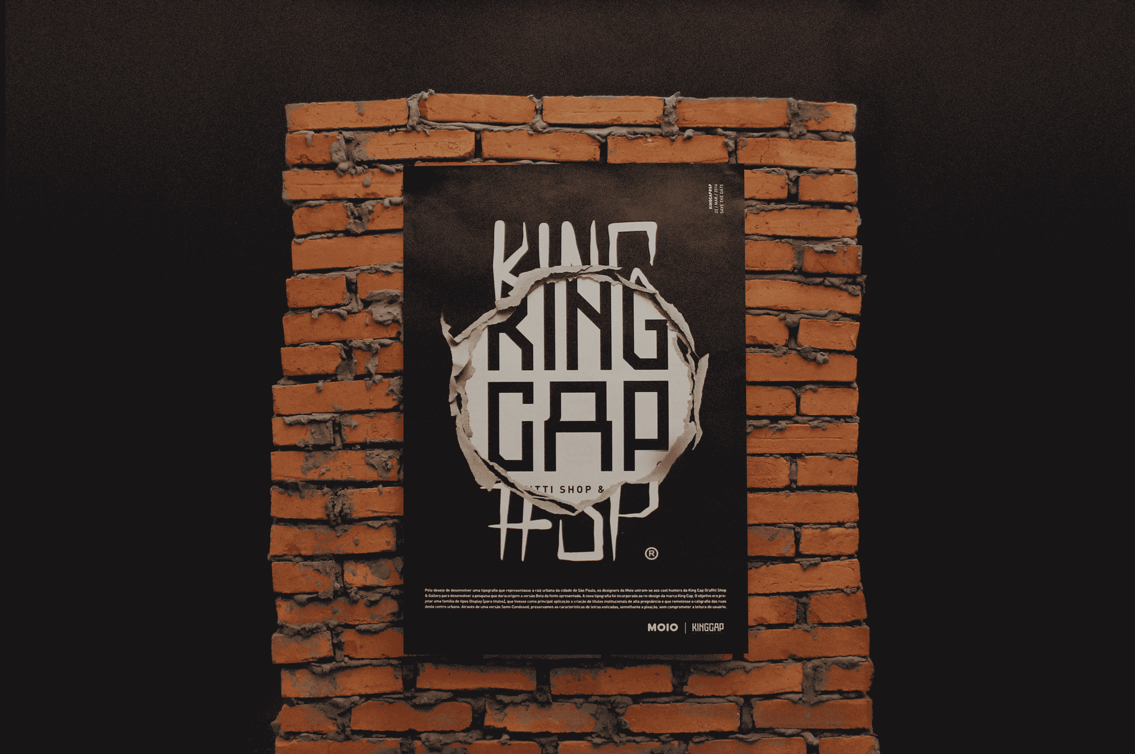
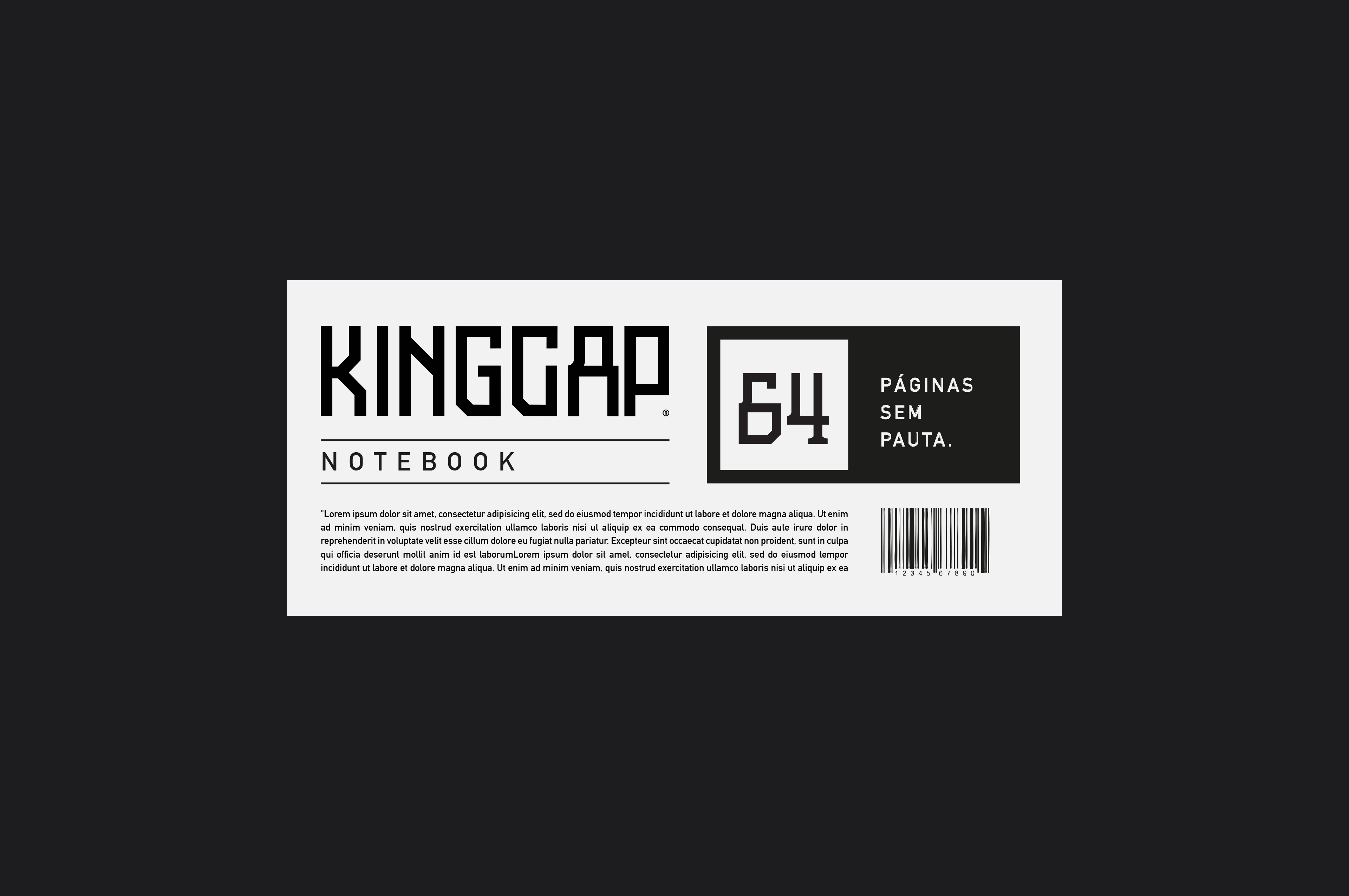
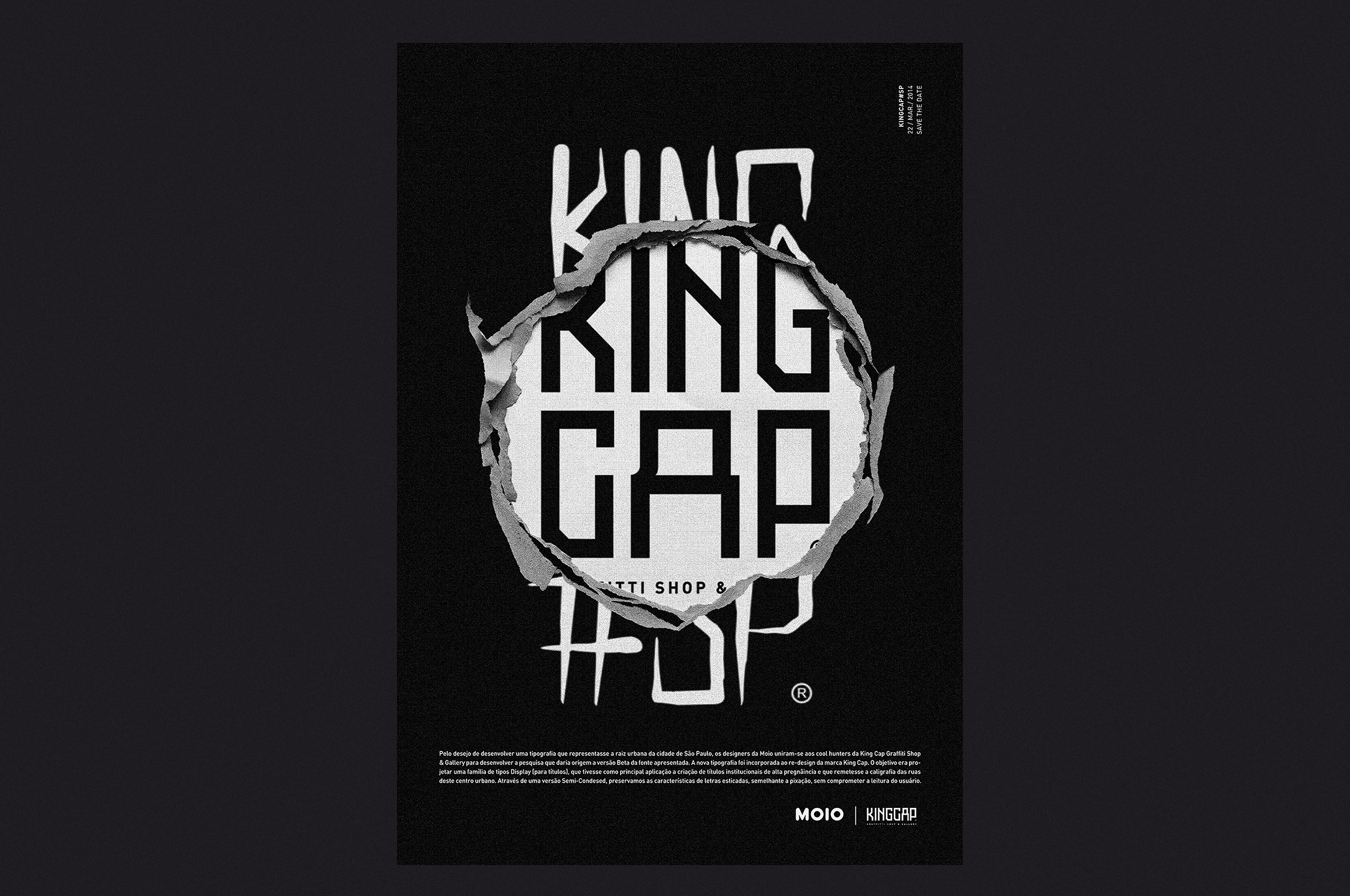
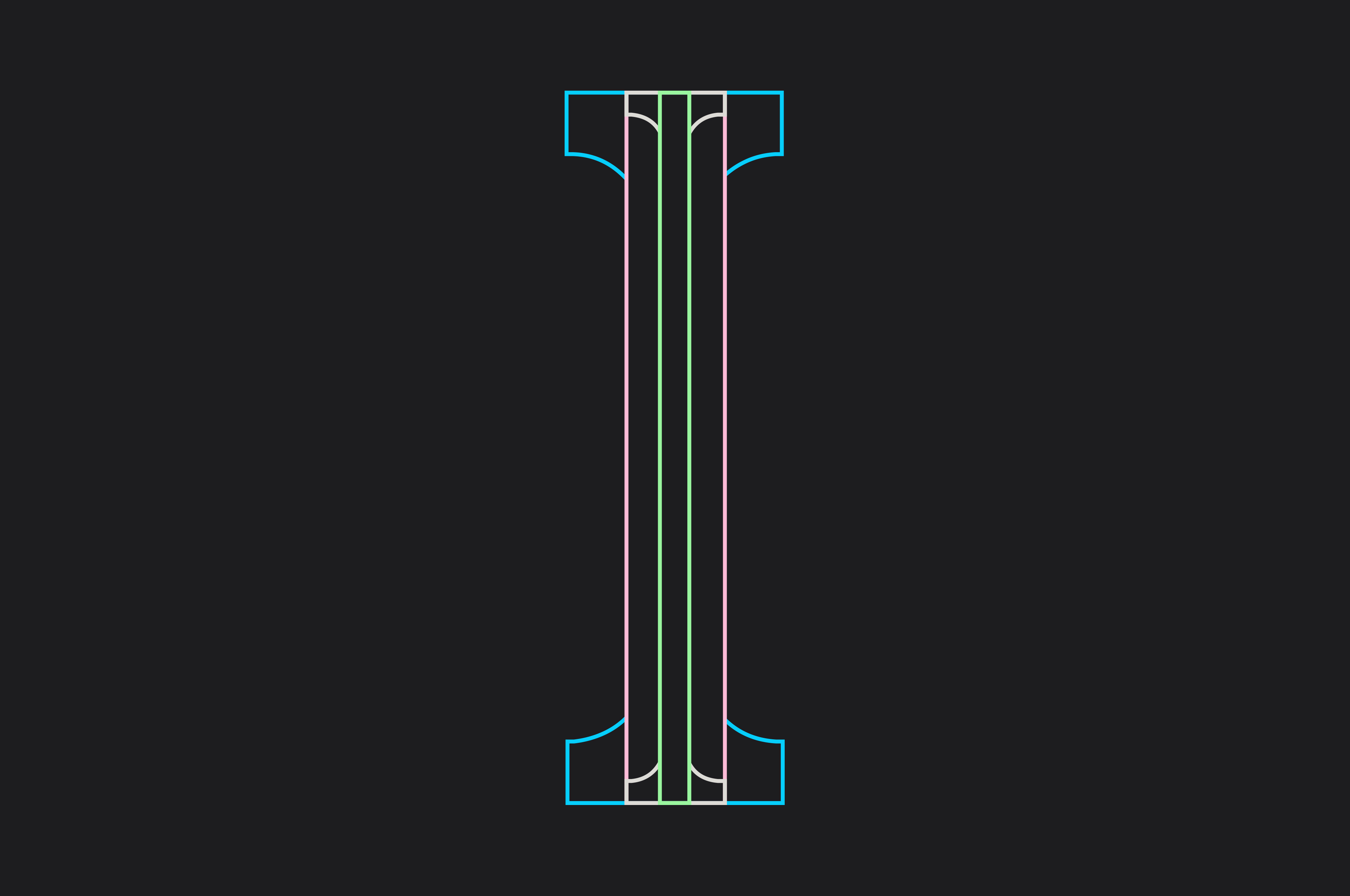
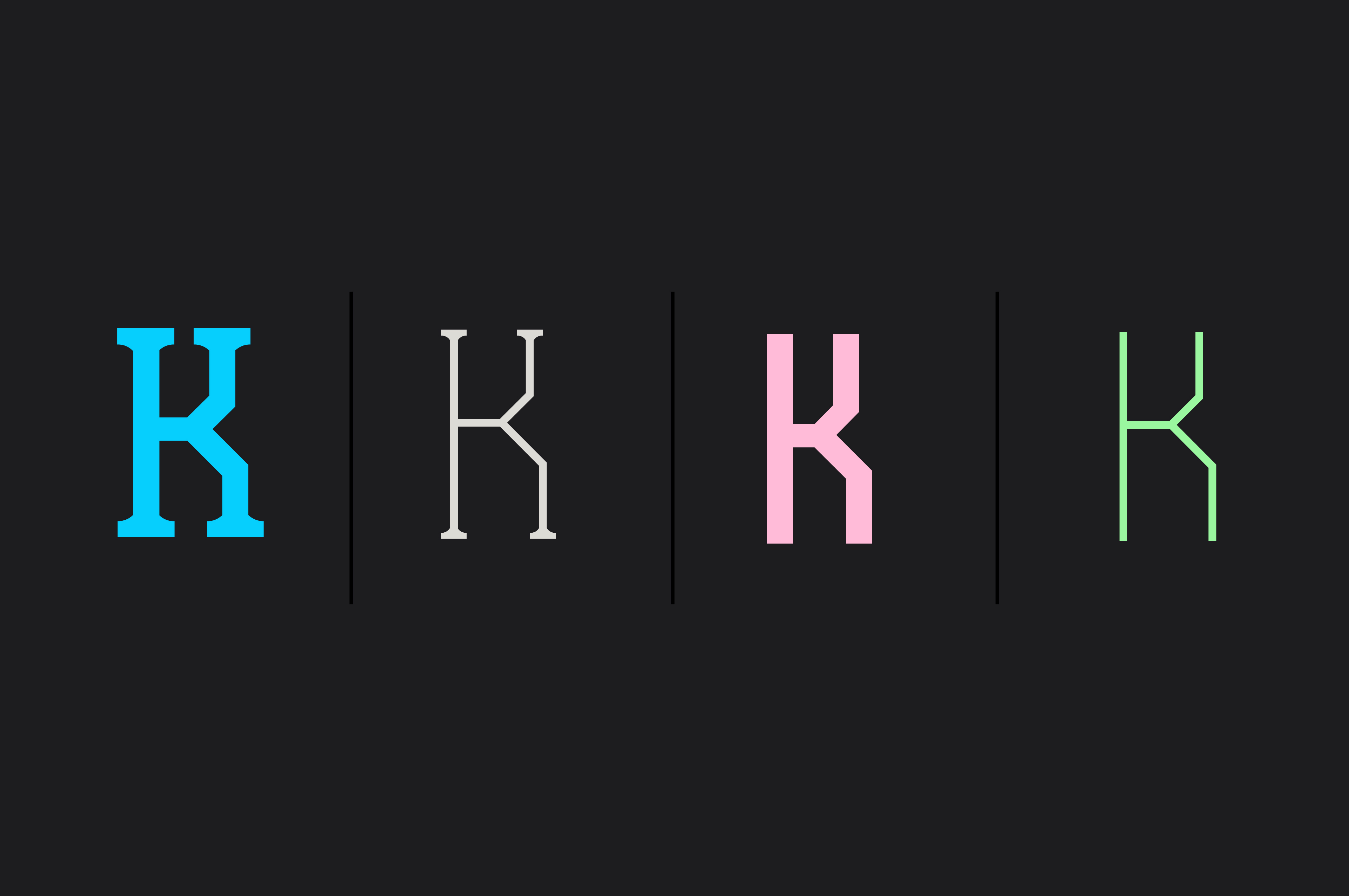
Kingcap was a graffiti shop in São Paulo. Its first visual identity was based on a traditional Californian graffiti style. For the rebranding we designed a custom typeface inspired by "Pixação", a very local graffiti style, as the main asset of communication, using it to create the logo and the full identity.
The research became a short documentary, SP in Types, discussing "pixação" from an aesthetic perspective.