Les cravates par Hermès
Back in 2009, this is a very nostalgic piece. Made for Designboom & Hermès in my very first design competition. The pattern was shortlisted. This recognition encourages the young version of me to follow the design journey.
Article
This is how I described the piece
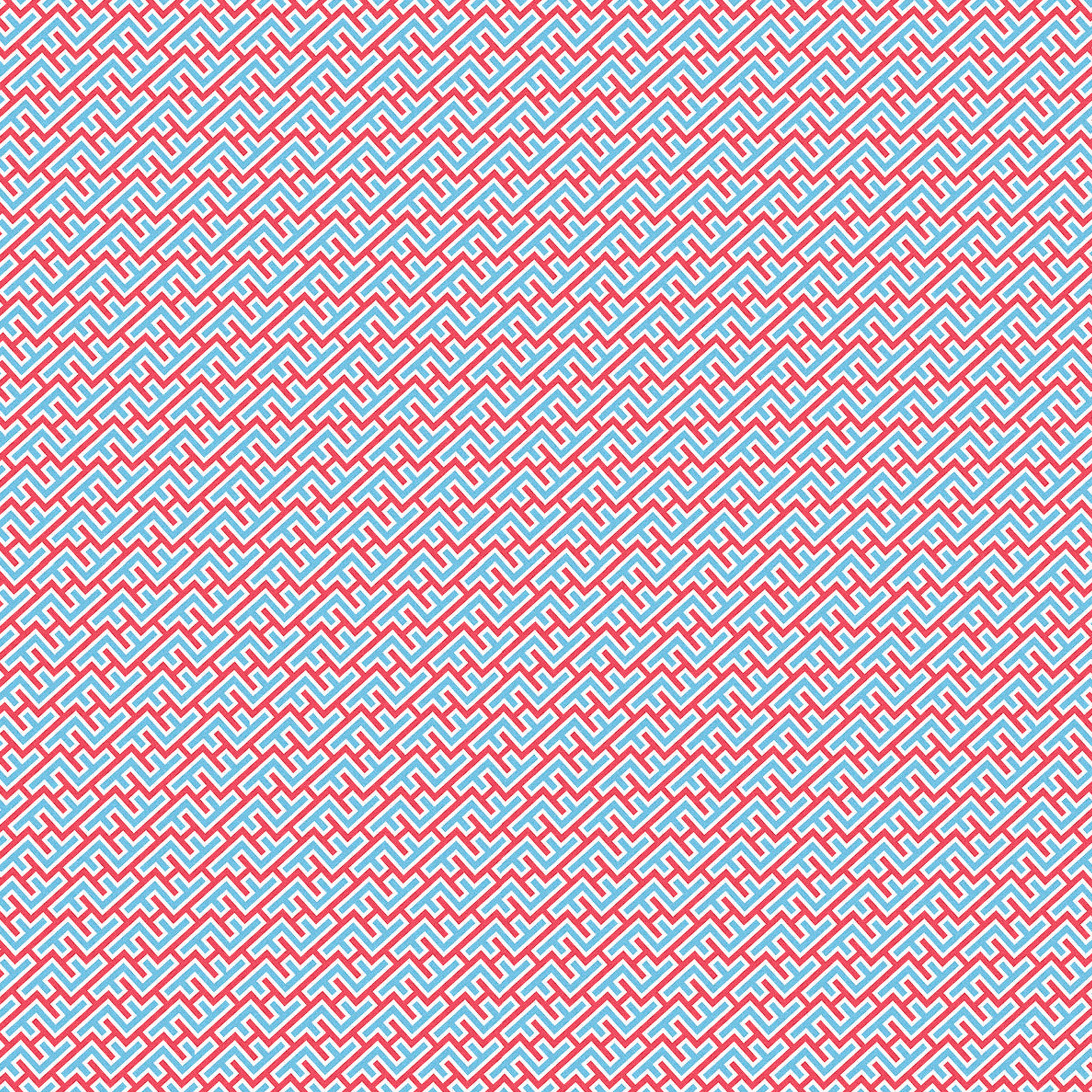
From two perpendiculars H’s, I developed an institutional pattern where the letter “H” is put into a frame in order to magnify the brand. The frame, however, is composed of two letters “F”, in a tribute to France, the brand's home country.
From two perpendiculars H’s, I developed an institutional pattern where the letter “H” is put into a frame in order to magnify the brand. The frame, however, is composed of two letters “F”, in a tribute to France, the brand's home country.
I made use of the French flag colors to reinforce the idea. When observed from a certain distance, this pattern makes it look like a few French flags, an illusion that is made possible since I used a straight font and the right order of colors.